
Situation
Our staff are not engaging with our security training
Task
Create user engagement, and make learning fun for us
Action
Design an Experience that Drives User and Team Engagement
I began by leading user research to analyze company requirements, staff personas, and user pain points. Based on this analysis, I developed an innovative approach that balances professionalism with user-friendly gamification. This strategy incentivizes friendly competition and enhances the learning journey by placing the user at the centre of the experience.
Result
An app that created a company staff 'Buzz' and instant uptake
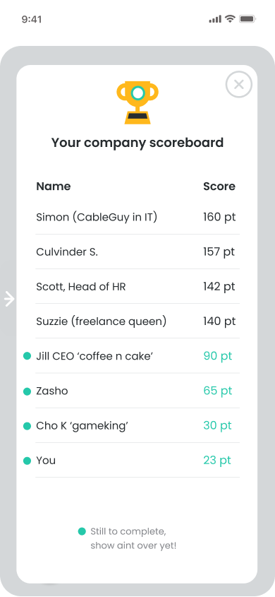
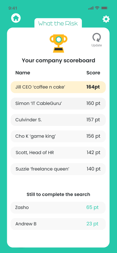
I created a 'Buzz' and emotional connection, resulting in improved uptake, engagement, and learning outcomes. Learning became enjoyable again! Team cohesion increased, with the CEO and head of IT entertaining the company by competing for the top of the scoreboard—one even hacked it to stay one point ahead of the other!
Development and ideation
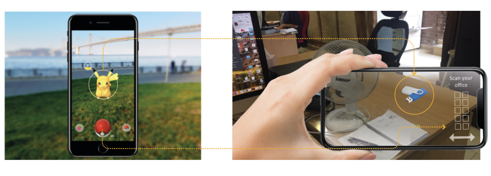
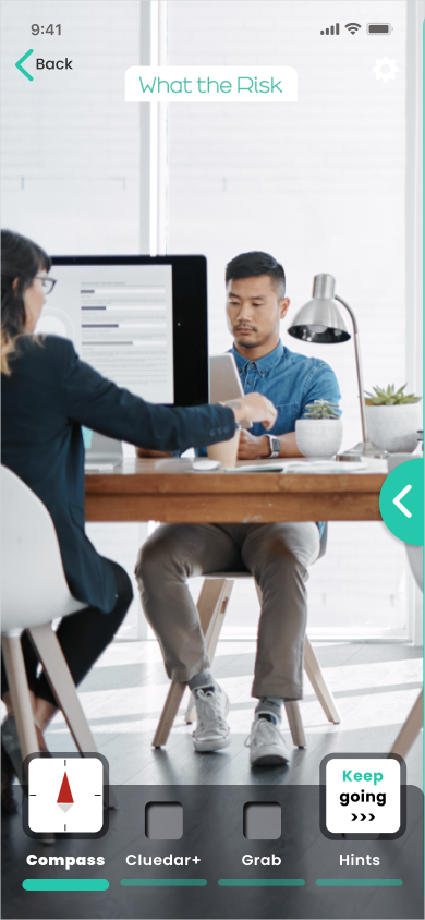
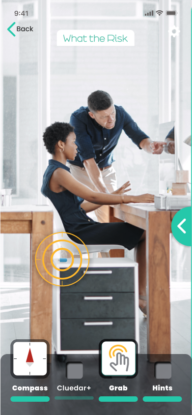
Inspired by the Augmented Reality techniques popularized by Pokémon Go, and having experienced the game and observed colleagues using it to capture virtual points, I aimed to create a learning product that encouraged a similar level of engagement and utilised the GeoLocation appearance of items.
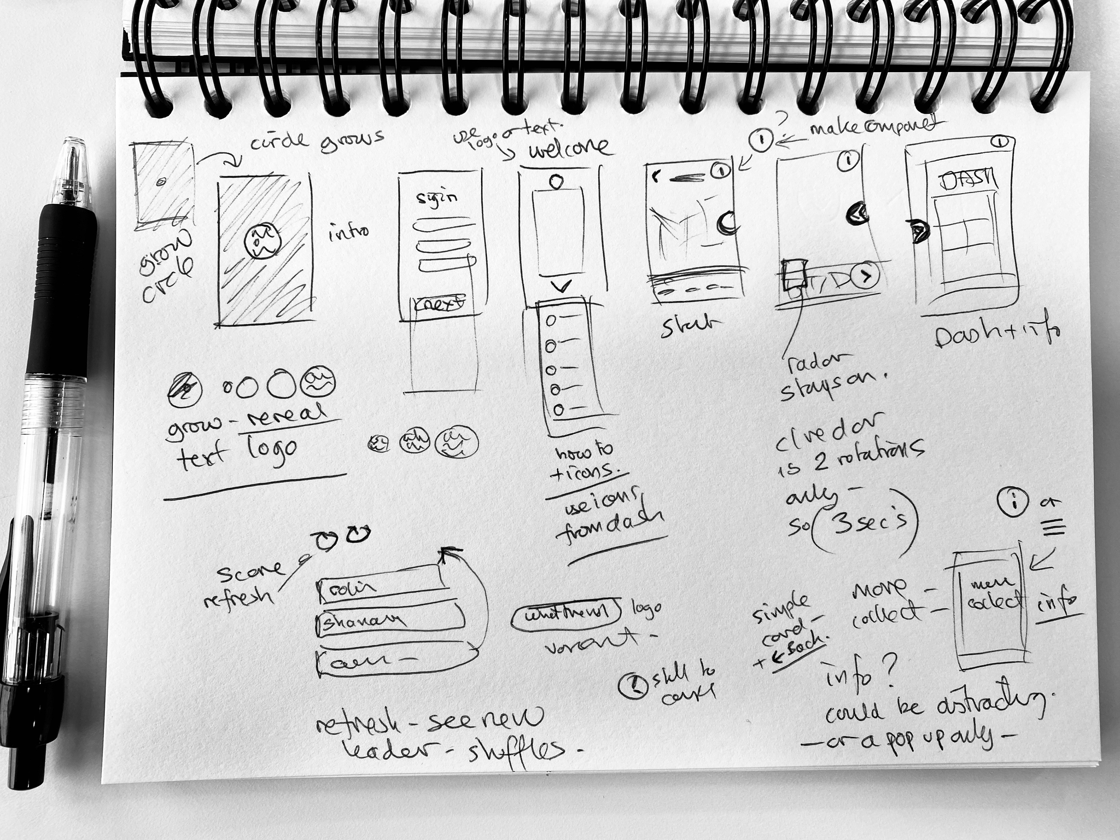
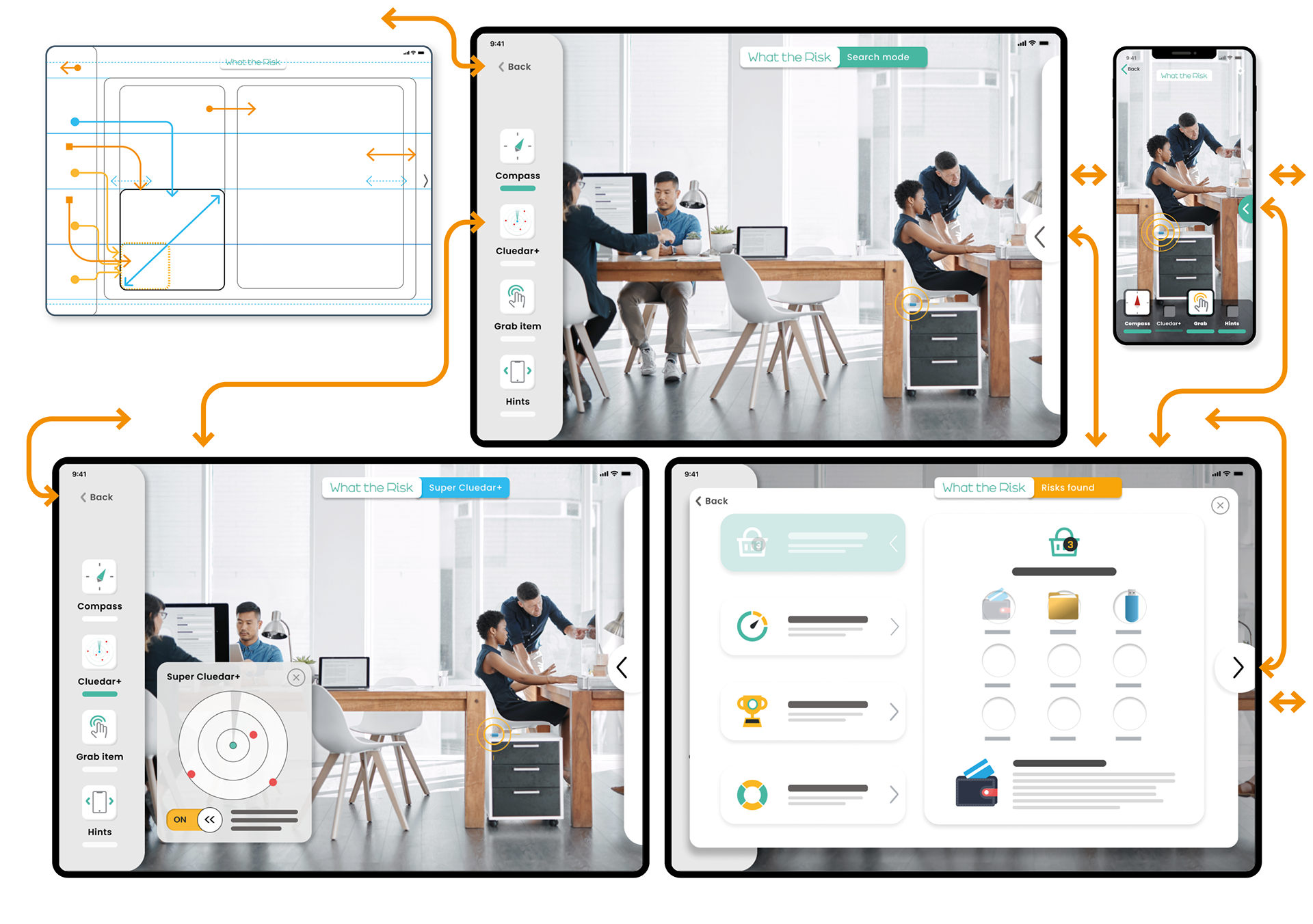
Design thinking and Paper Prototyping development
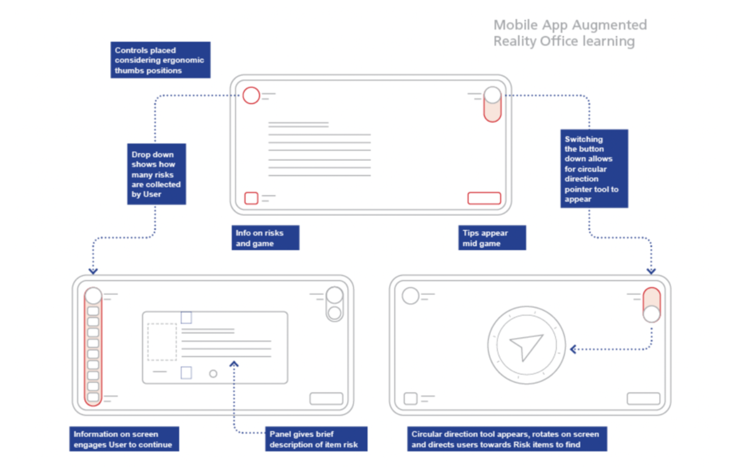
Initial sketches and mock-ups showcased the AR dashboard concept and wireframes.

I then sketched ideas for prompts, and a control dashboard.
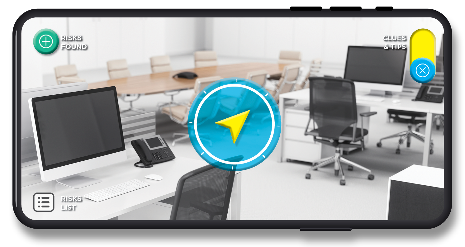
Dynamic Dashboards, building patterns for human habit and interaction
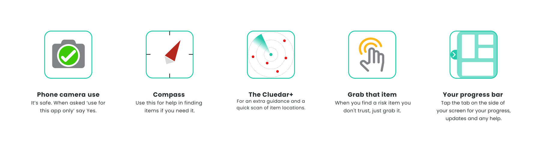
A consistent, easy-to-access dashboard builds user familiarity and speeds up use, allowing for quick access to help, tips, and scorecards in comfortably reachable screen areas.
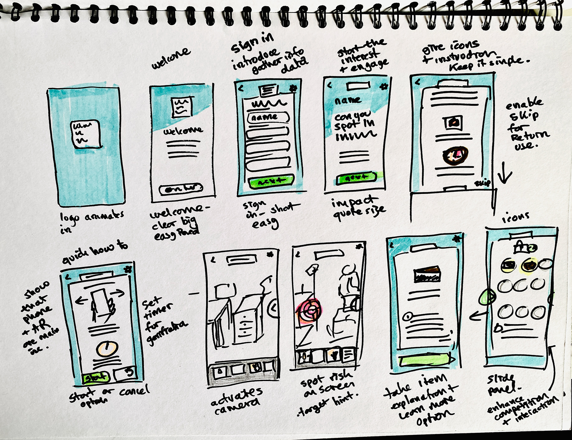
Iterative stages of refinement to journey
I refined the app to enhance user-friendliness, focusing on ergonomic design and hands-on use. I tested the portrait mobile mode and created paper sketches, including a slide-out panel with guides and help icons to improve usability and accessibility.
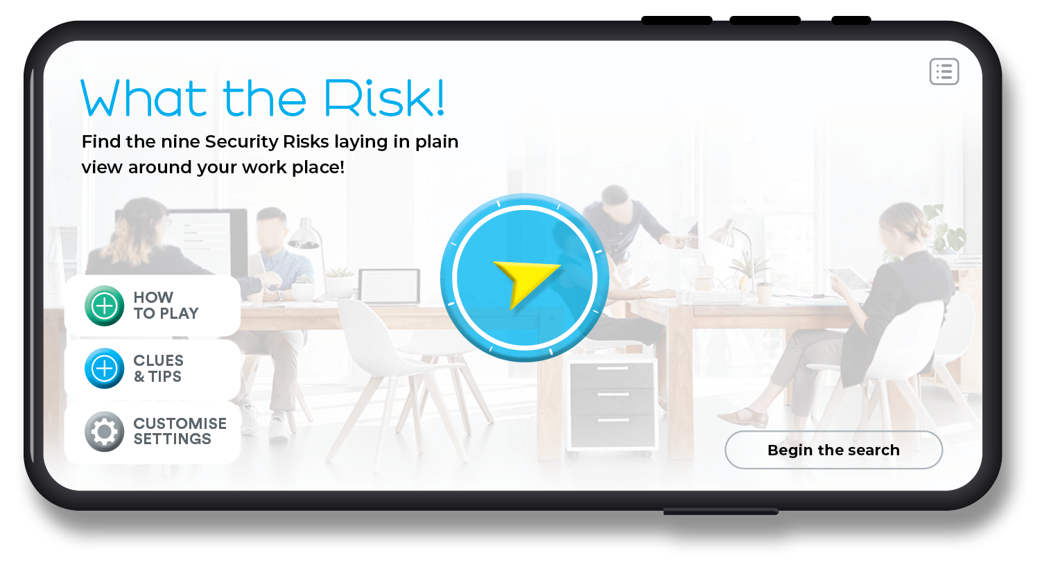
Mini journey plan with loading logo and templates
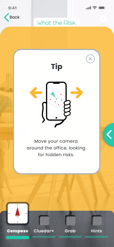

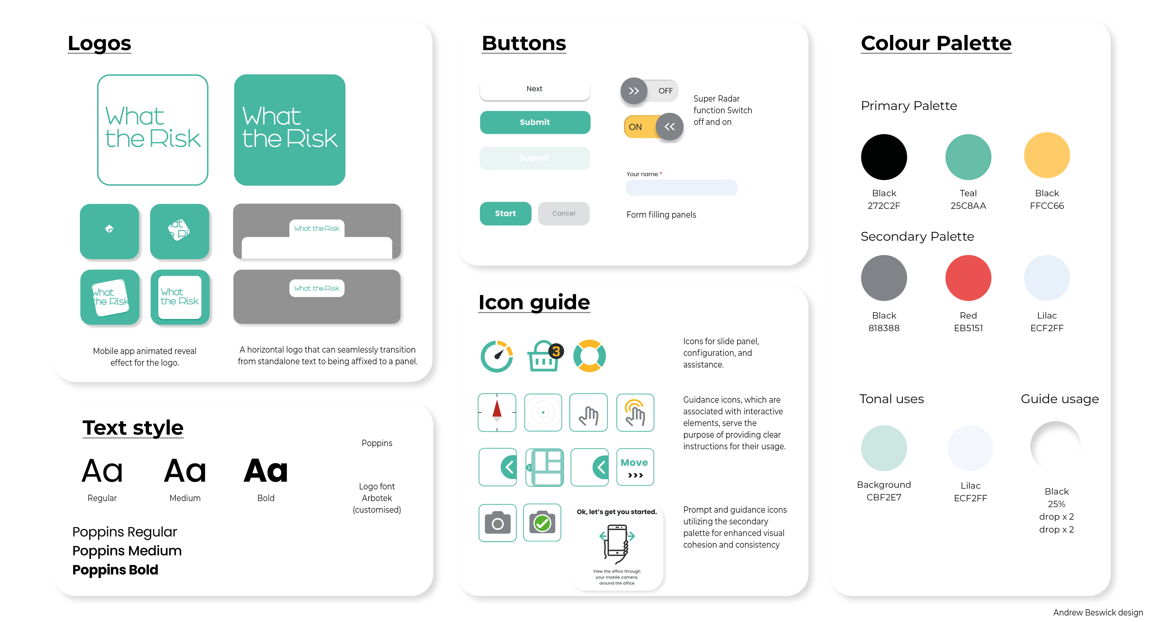
Brand creation, and why 'What the Risk'
The name plays on the surprise of "What the ---," reflecting how many users are unaware of everyday risks. I developed a consistent brand with eye-catching colors, typography, and font styles to ensure clarity in actions, responses, and learning.
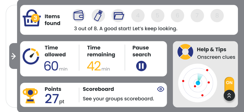
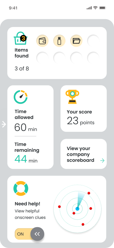
Dashboard User-Centered design
Redefining CX ergonomics, I refined the design for the iPad/tablet version. I created wireframe guides to illustrate options and ensure easy screen handling for user interaction.

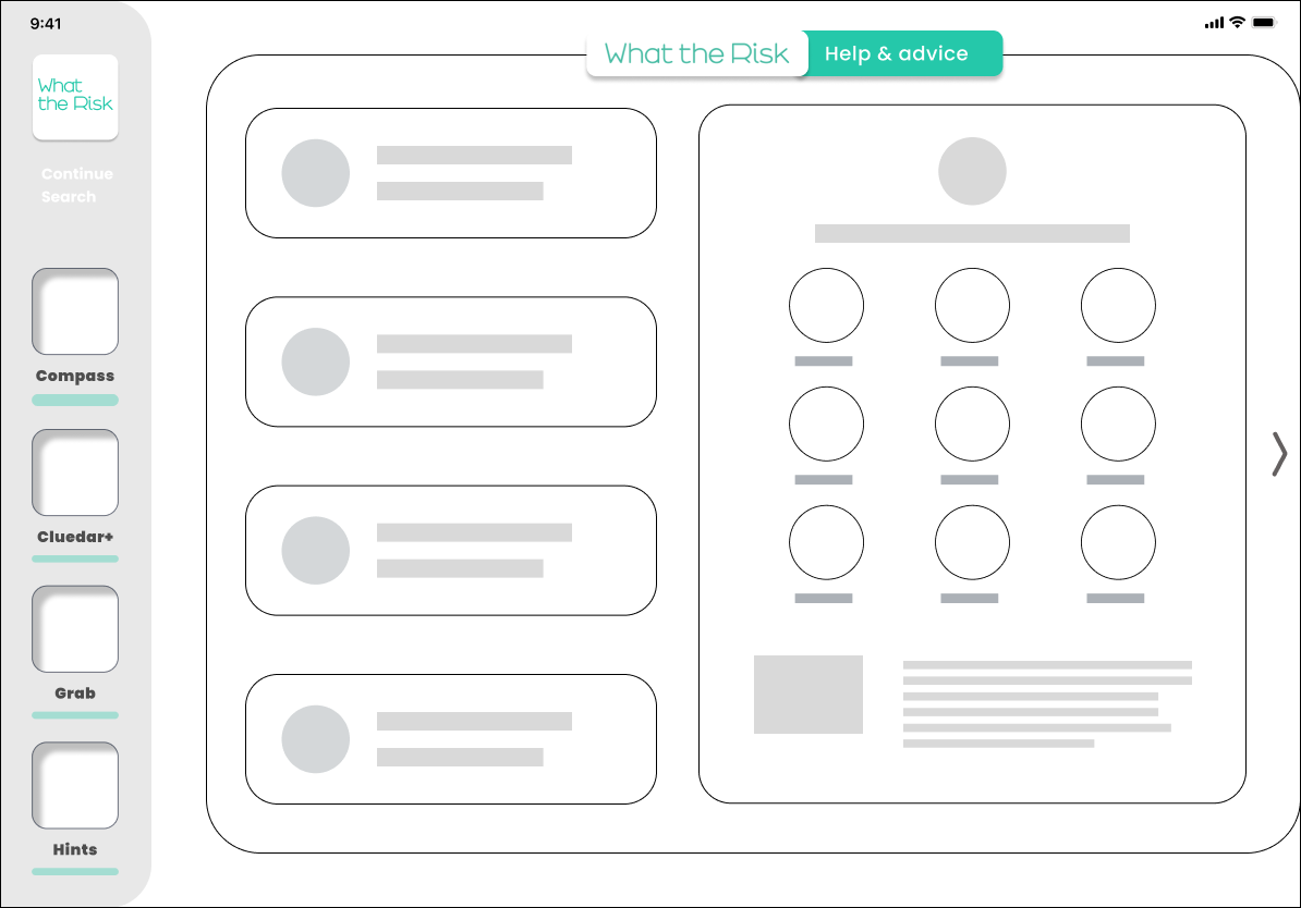
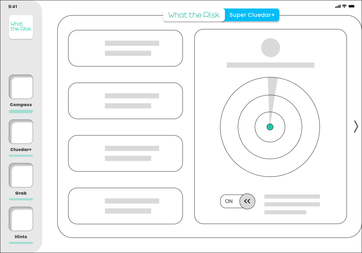

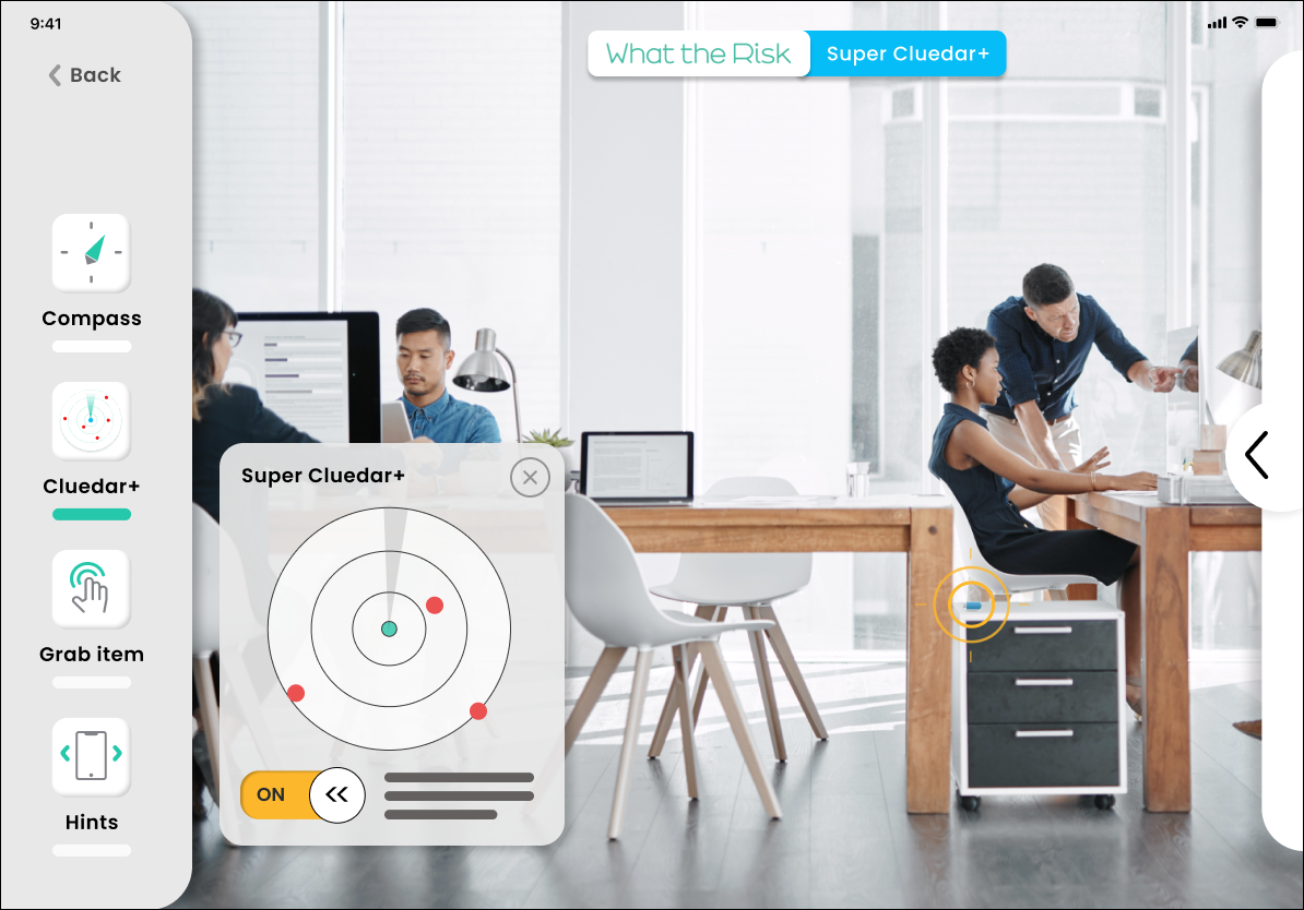
Engaging Staff and Boosting Behavioural Change and Awareness
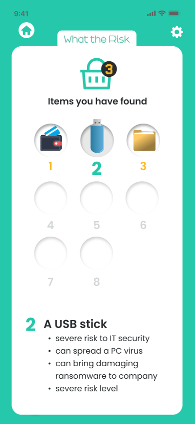
Testing revealed users were highly engaged and motivated to find the entire collection after discovering just two items. By integrating game mechanics into the e-learning platform, I enhanced user engagement and learning outcomes. Team cohesion improved, along with uptake.

Animated Demo