First wave of visual designs gave the process a face and character—using UX thinking, wireframes, and rapid ideation to break down a complex three-tier problem into simple, clear steps. I introduced strong signposting to guide users, avoid pain points, and reduce drop-off.
Situation
The onboarding system was overcomplicated. I stripped it back, redesigned it around user needs, and made the journey clear, fast, and friction-free.
Action
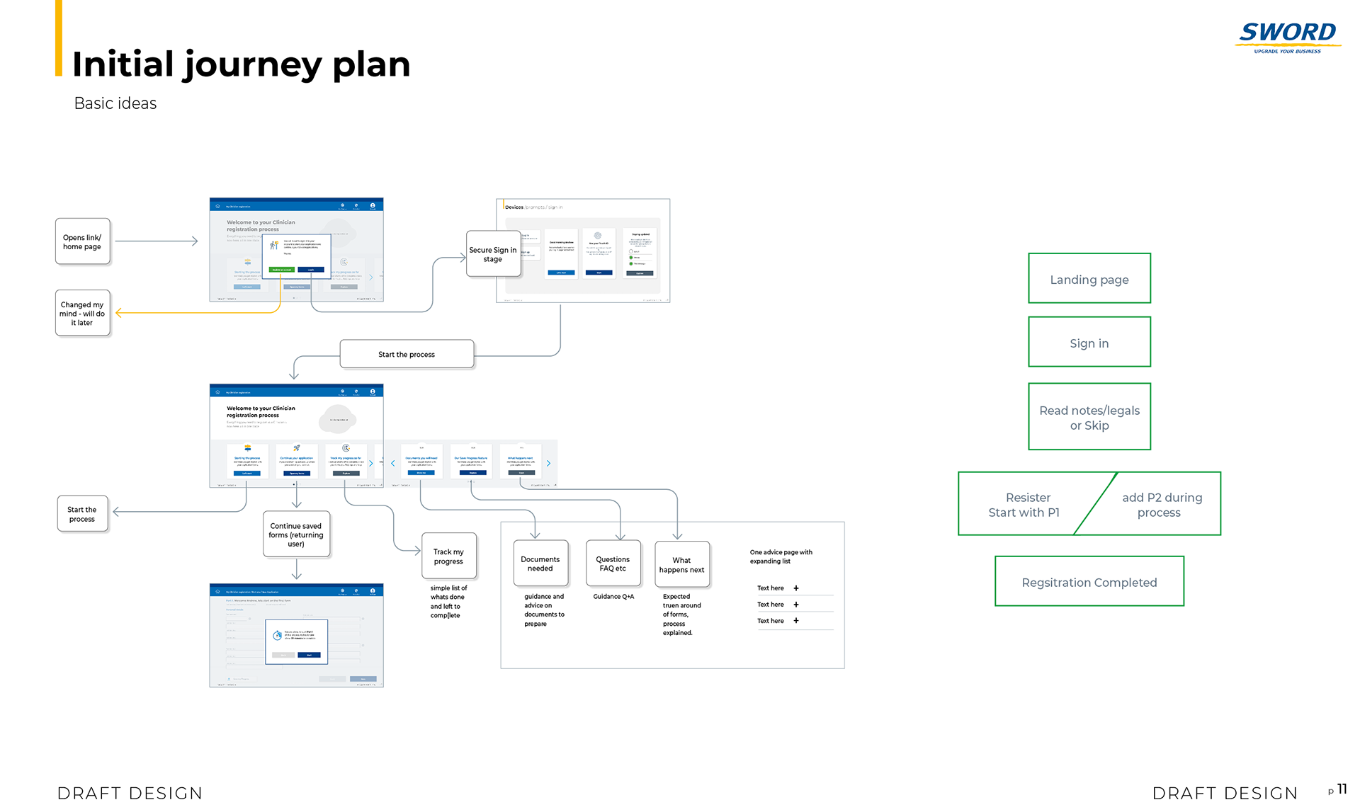
Development wireframes and designs focused on journey planning and analysis—balancing prompts, security, and simplicity. I audited all forms, visualised comparisons, and reworked the process to make it clearer. Worked closely with multiple teams to give the experience a face and drive real change.


Development
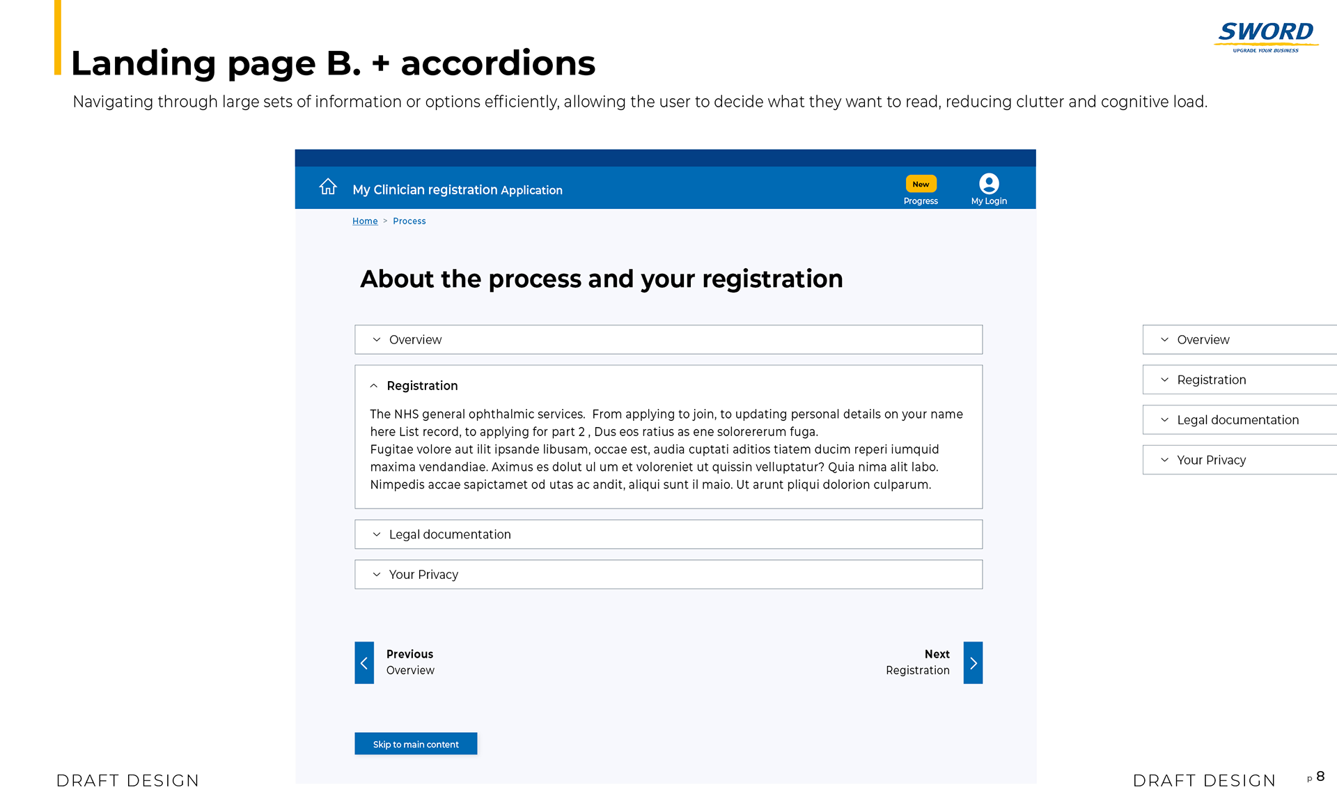
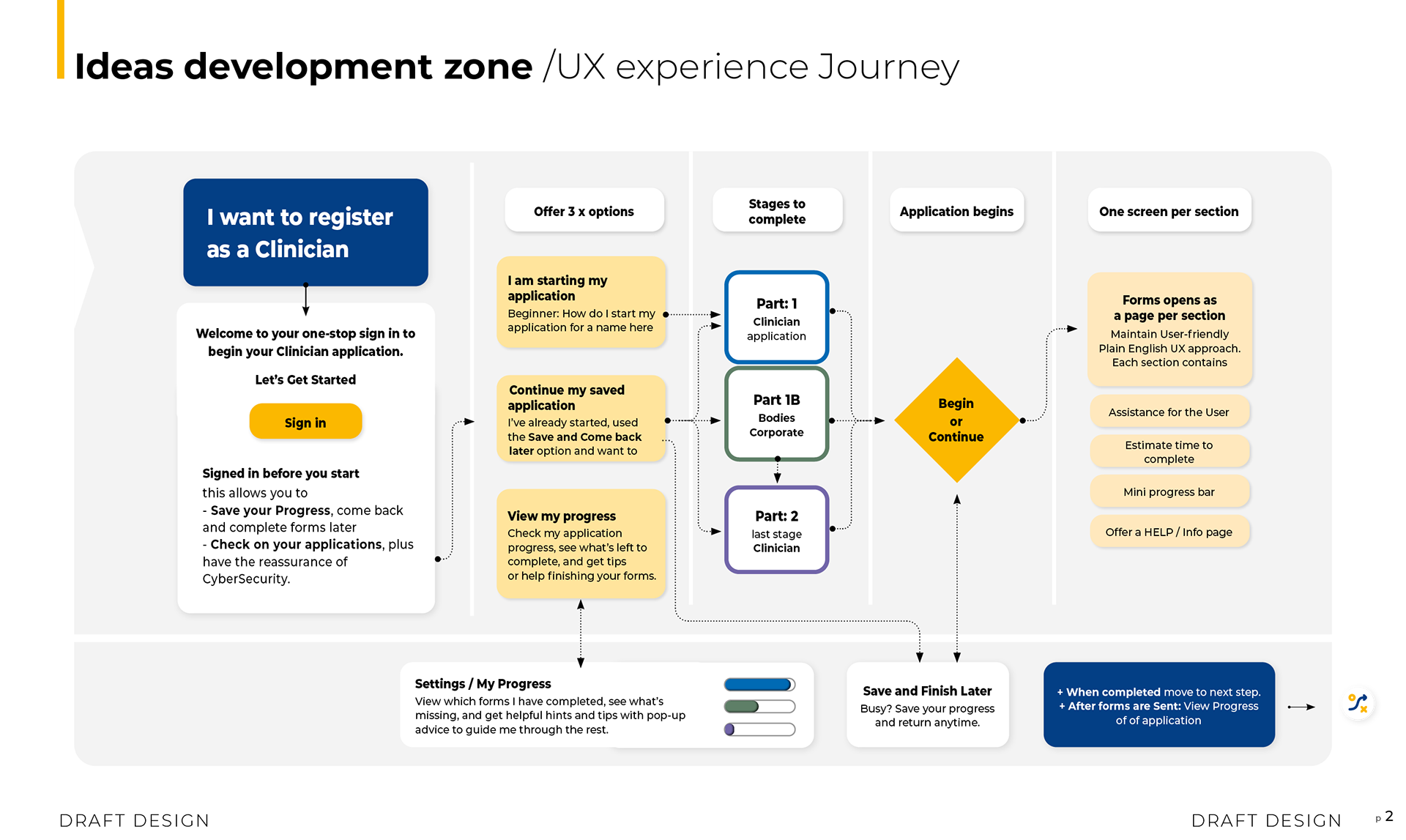
Journey visualisation for clear user interface


Analysis
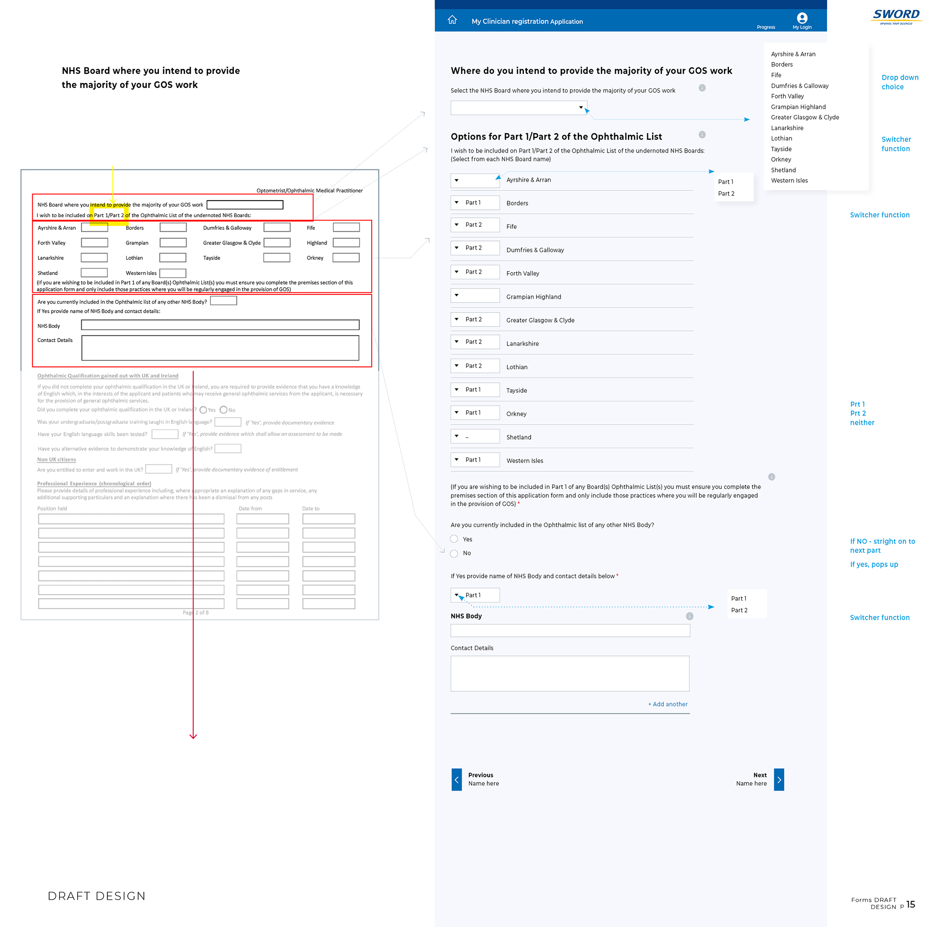
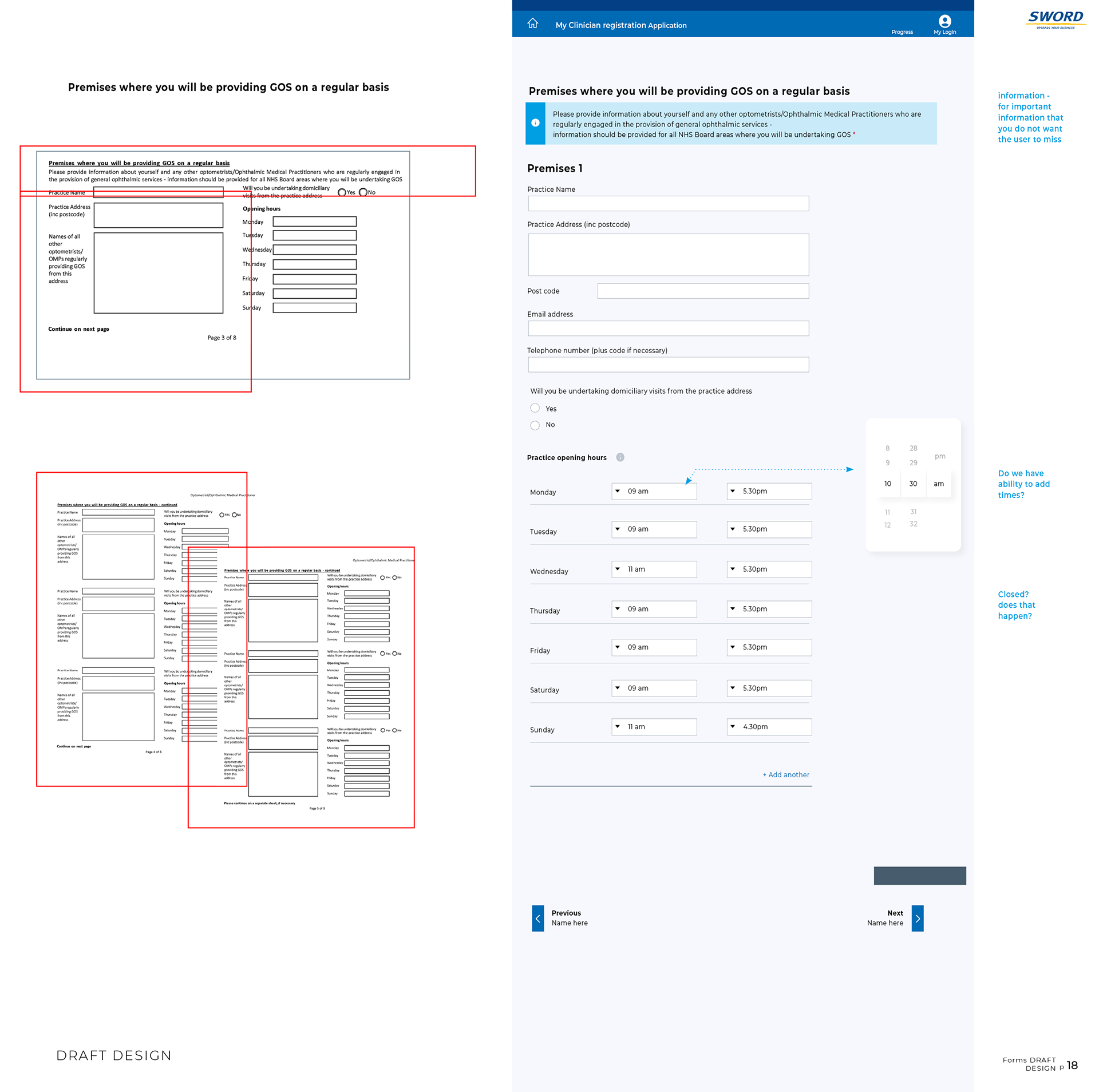
Faced with an overcomplicated legacy system, I mapped the entire process—highlighting repetition, complexity, and gaps in clarity. Then I redesigned it from the ground up, aligning with new GDS and experience standards to create a cleaner, smarter system.

Result
A few slides showcasing my UX analysis breakdown, showing legacy complexity broken down into simplified GDS systems, reducing multiple repetitions within information architecture.