Situation
Users were not fully engaging with the booking process.
Task
Create a personalised, AI-driven experience to enhance Customer Experience.
Action
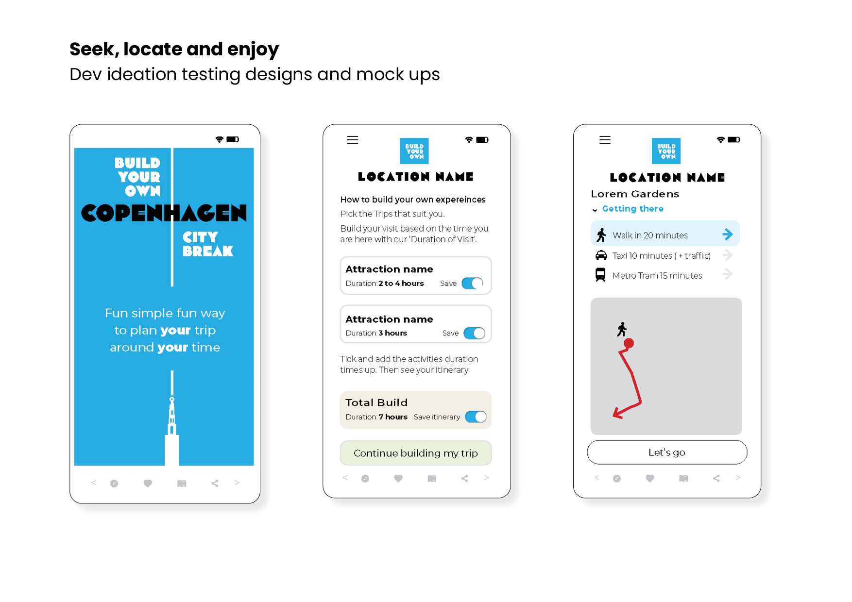
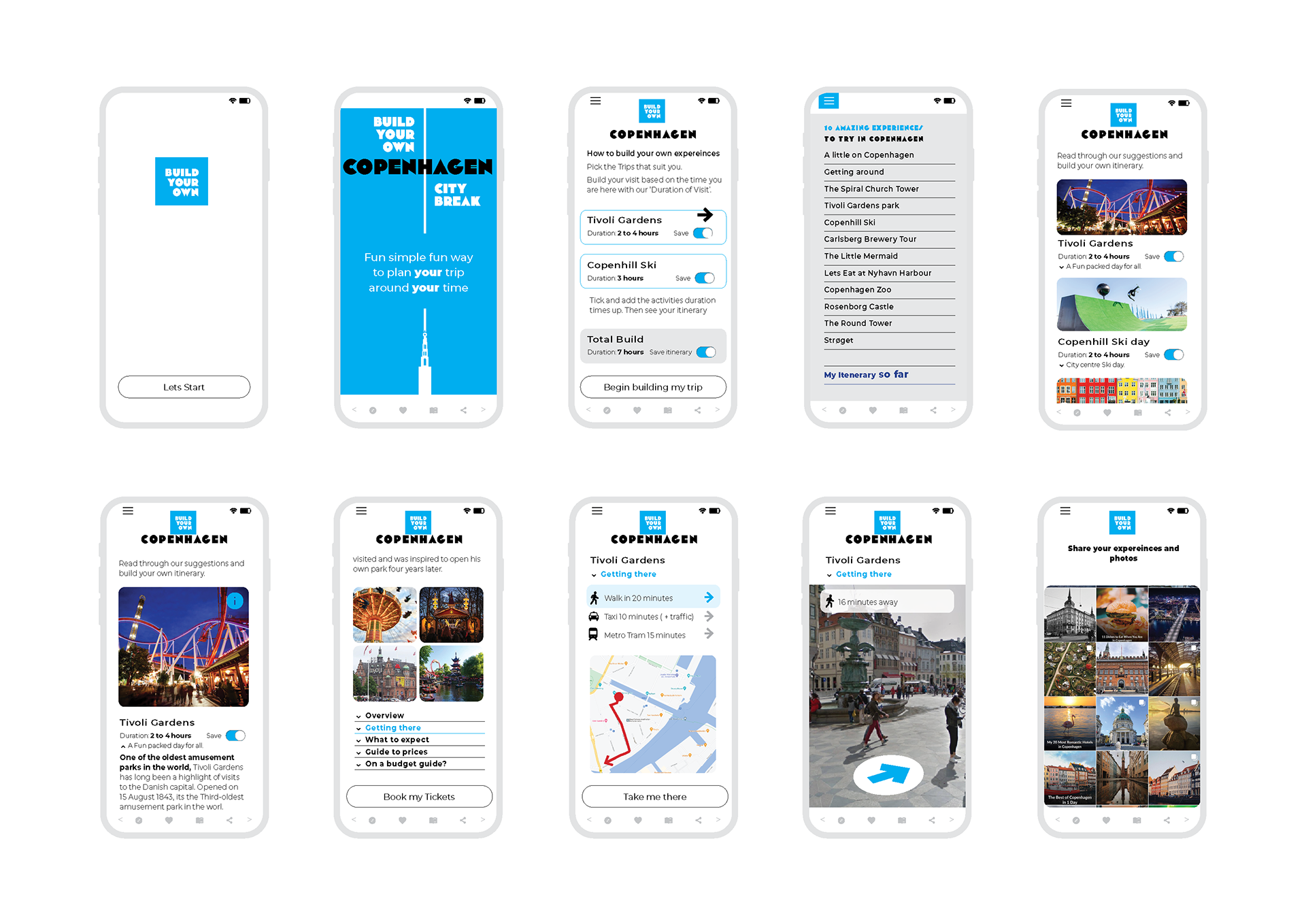
I designed an AI-driven booking app, incorporating iconic, colour-coded visual categories for selecting and customising holidays. Feedback from user interviews informed an engaging interface that builds an emotional connection.
Results
User testing showed 100% positive responses. Users quickly connected with the icon-based system, AI-driven suggestions were popular, and engagement and purchases—including on-site events—significantly increased. One user remarked they wished they had this tool for their last vacation.
One user remarked they wished they had this tool for their last vacation, asking if it was available now.
Development stages
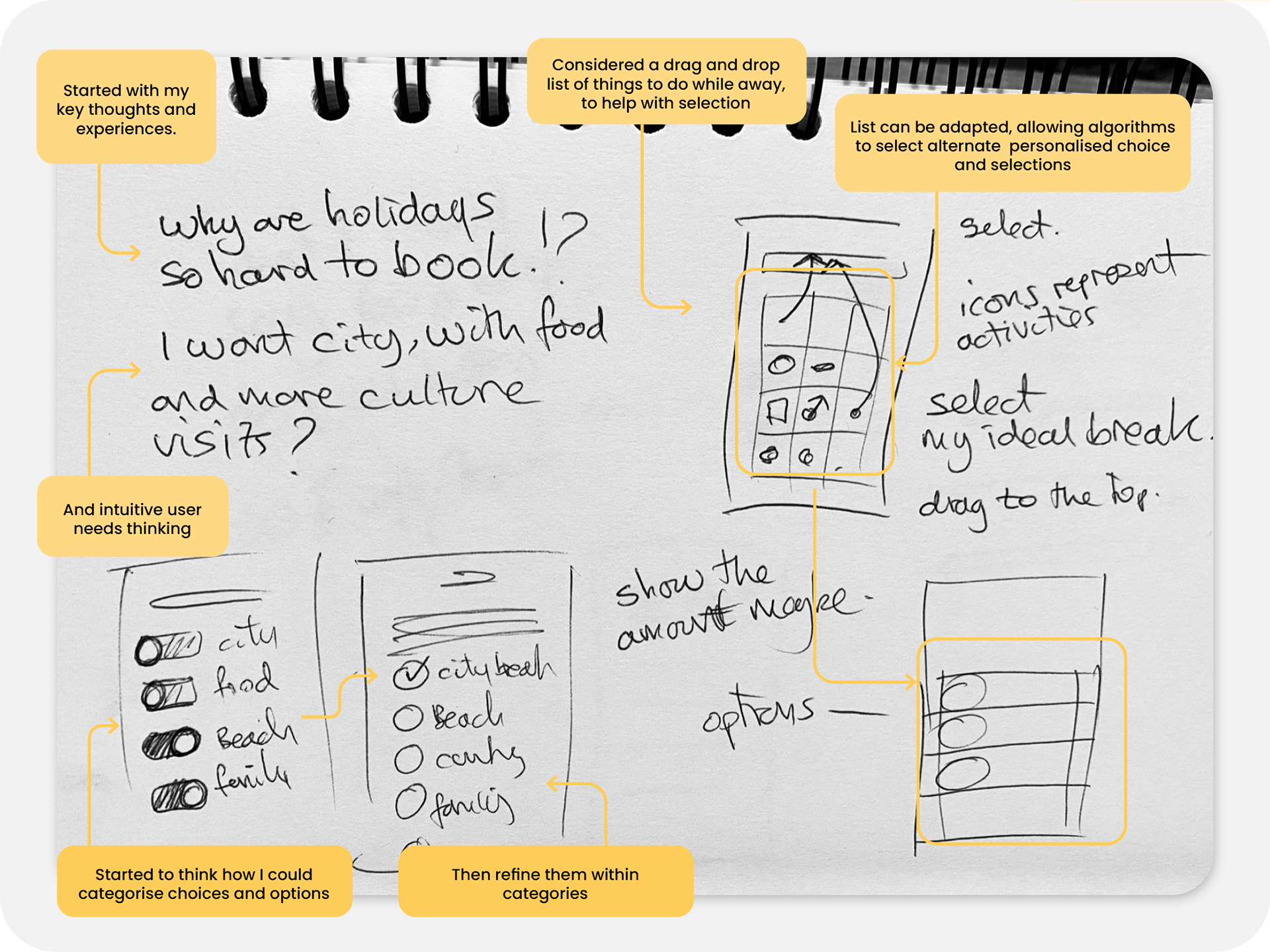
Initial sketches and ideas focused on creating a user-friendly, intuitive experience.

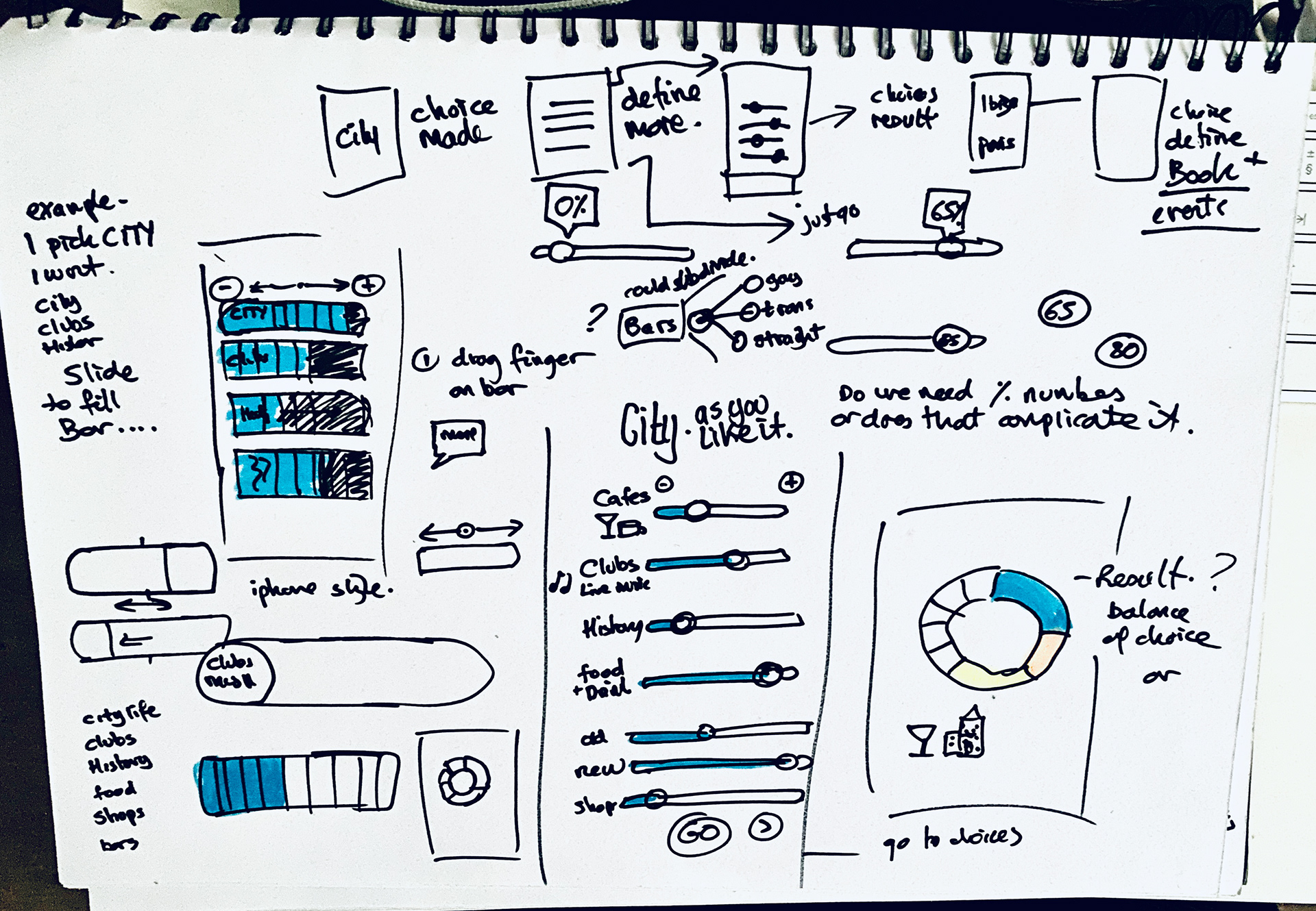
Developing Sketch work
Visualising the Service and Experience for demonstration purposes
Development stage
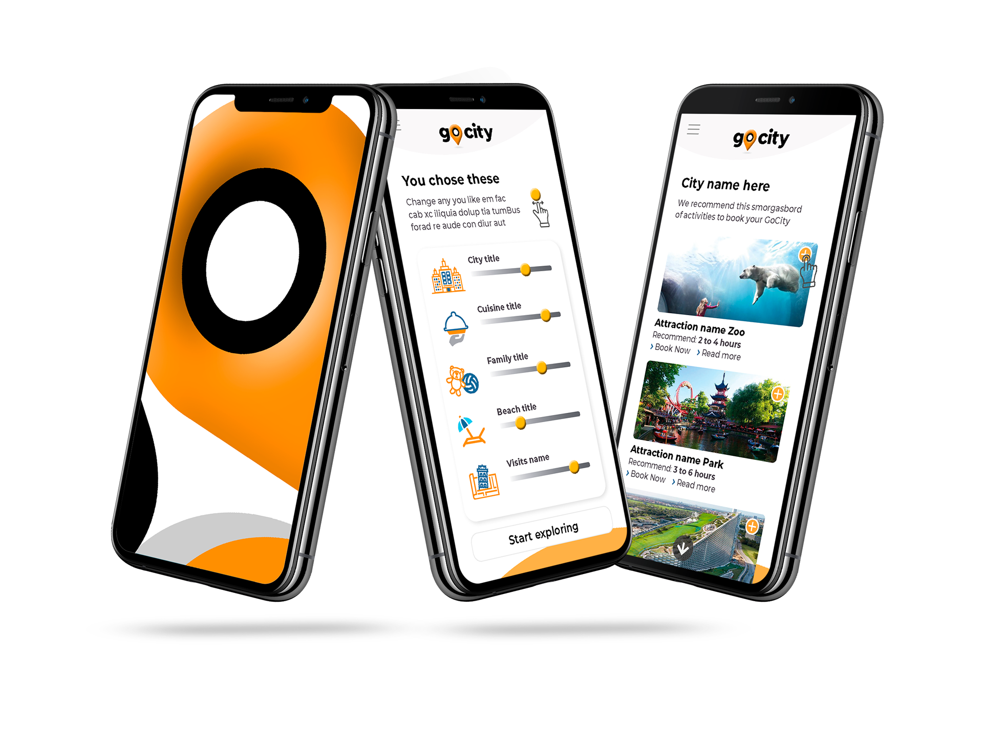
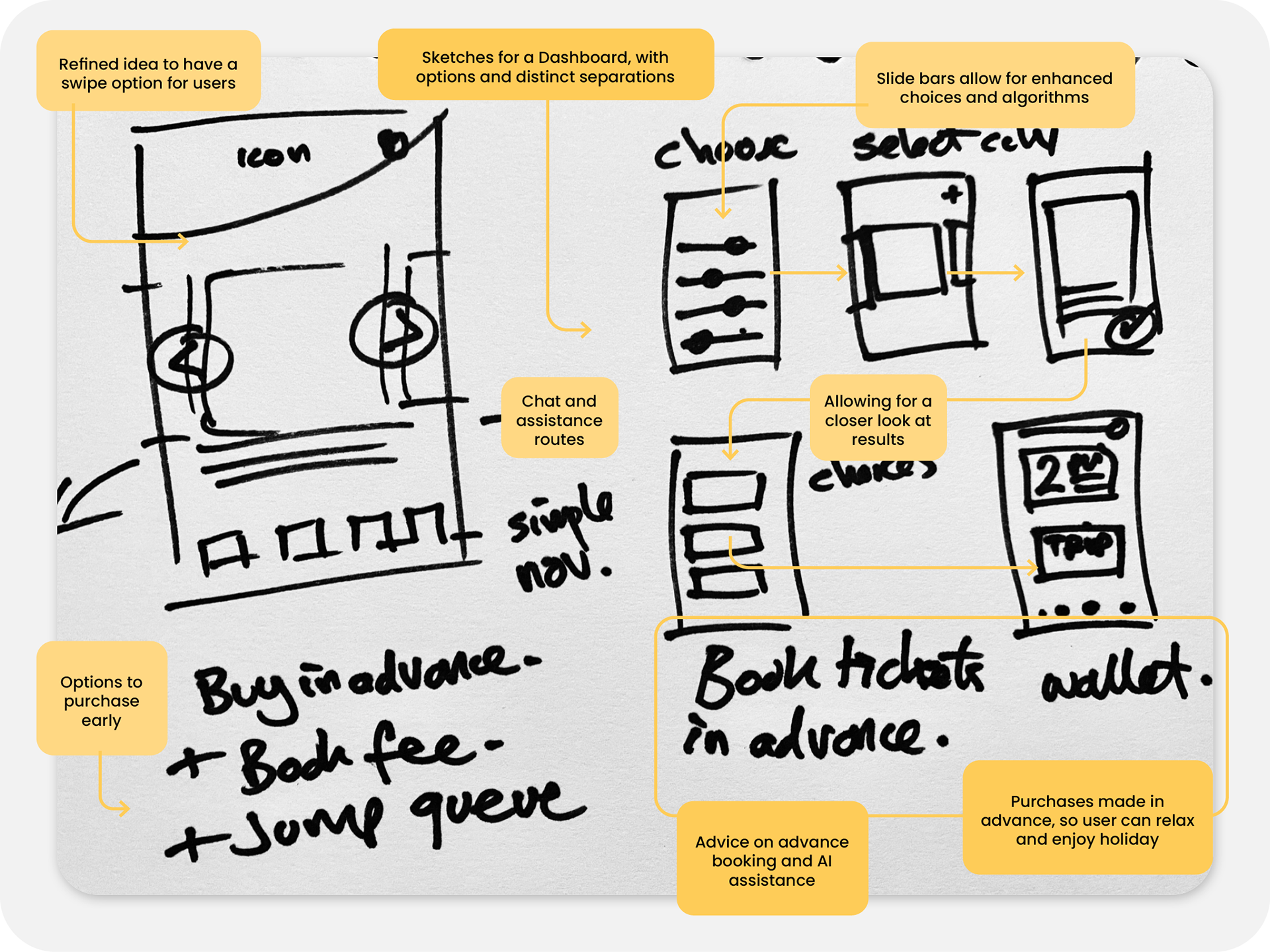
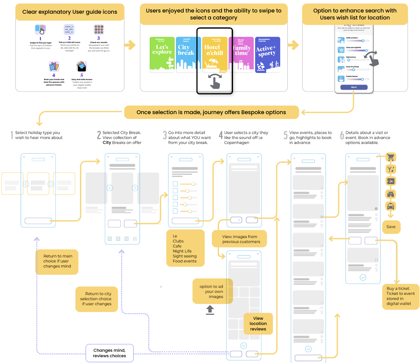
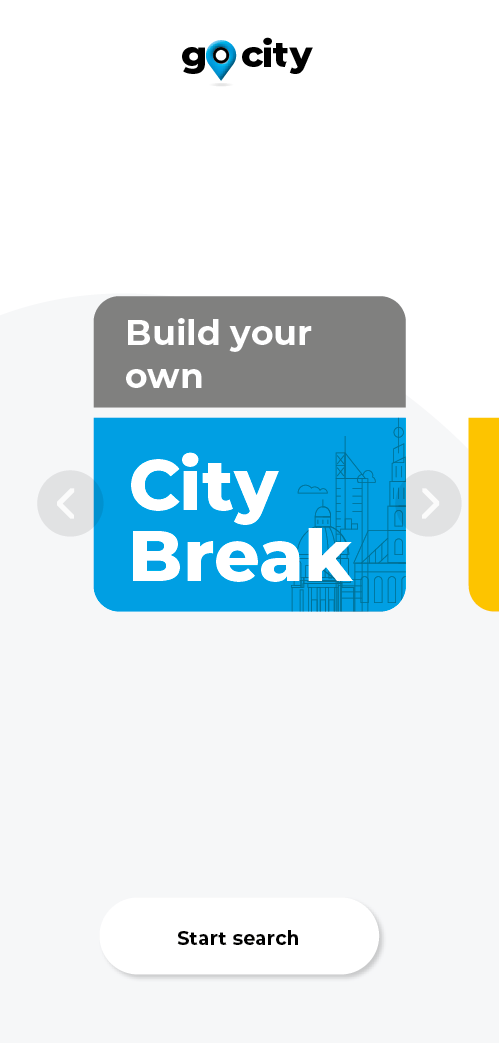
First draft designs, with interaction choice screen. Early design tests incorporating fonts, icons, and colour palettes, along with user recognition icons. I implemented an animated opener for the prototype based on a strong location icon idea.

Brand development
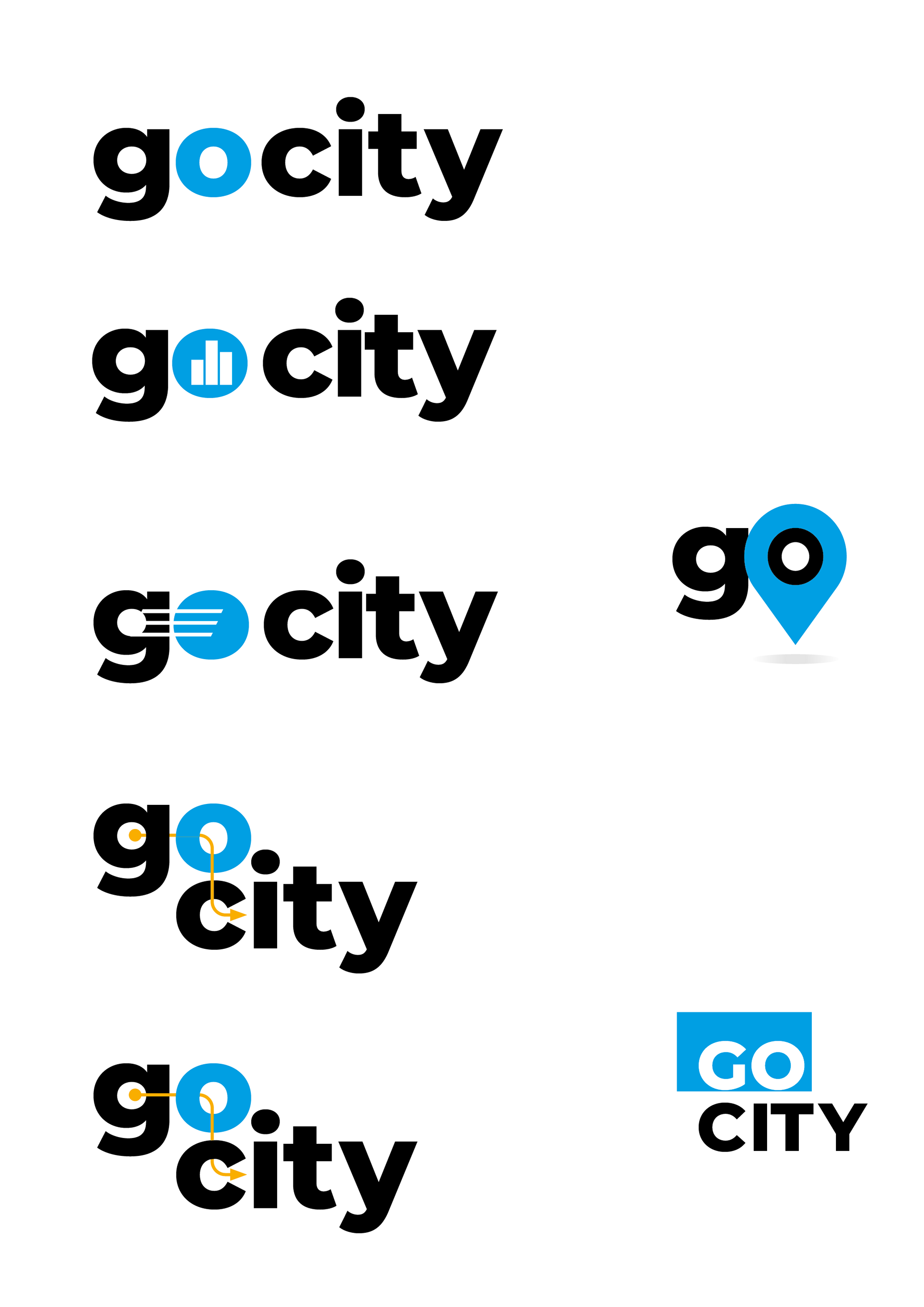
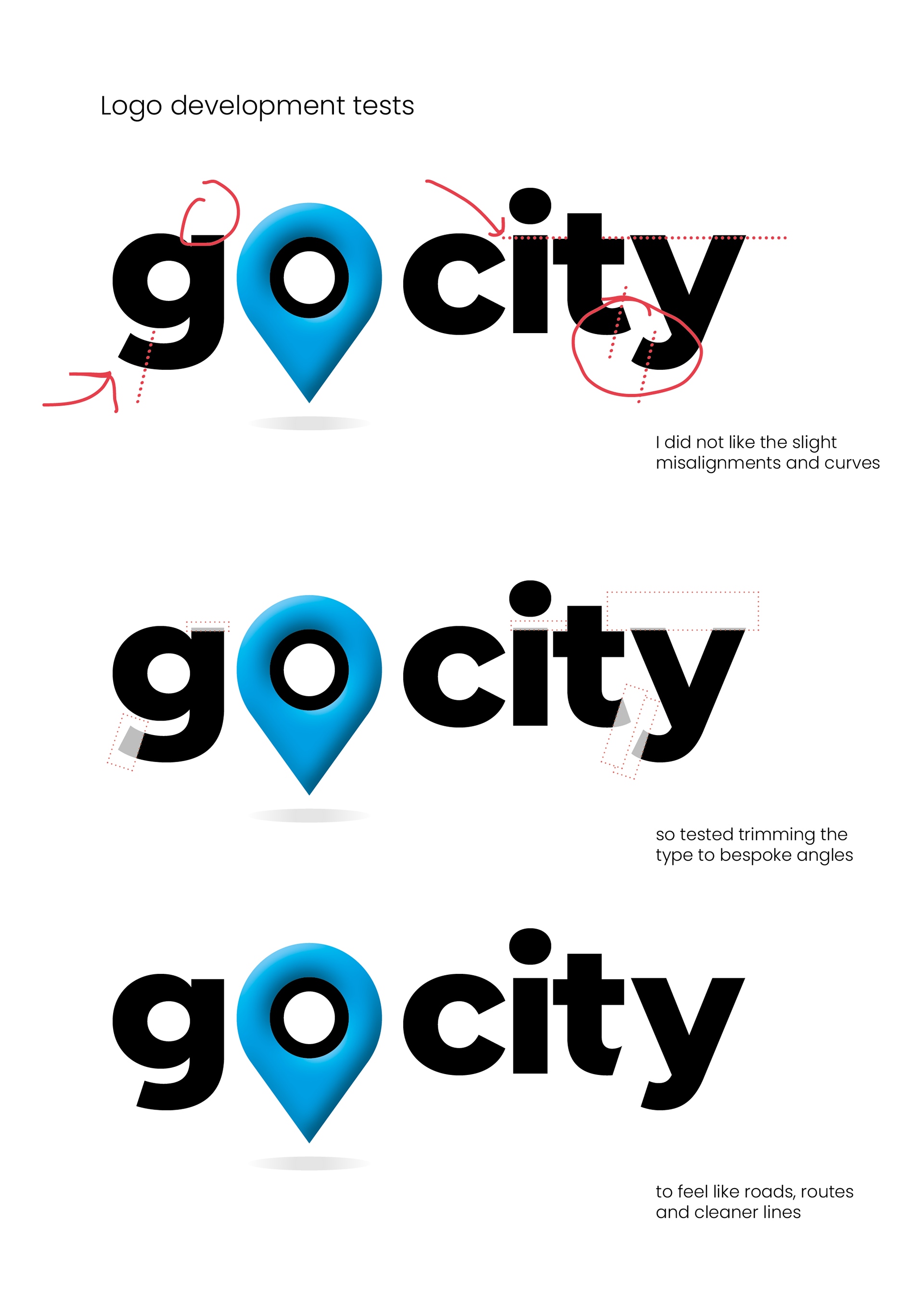
Brand and logo development
Innovated ideas using holiday types, location finding, icons and movement iconic cities and holiday types.
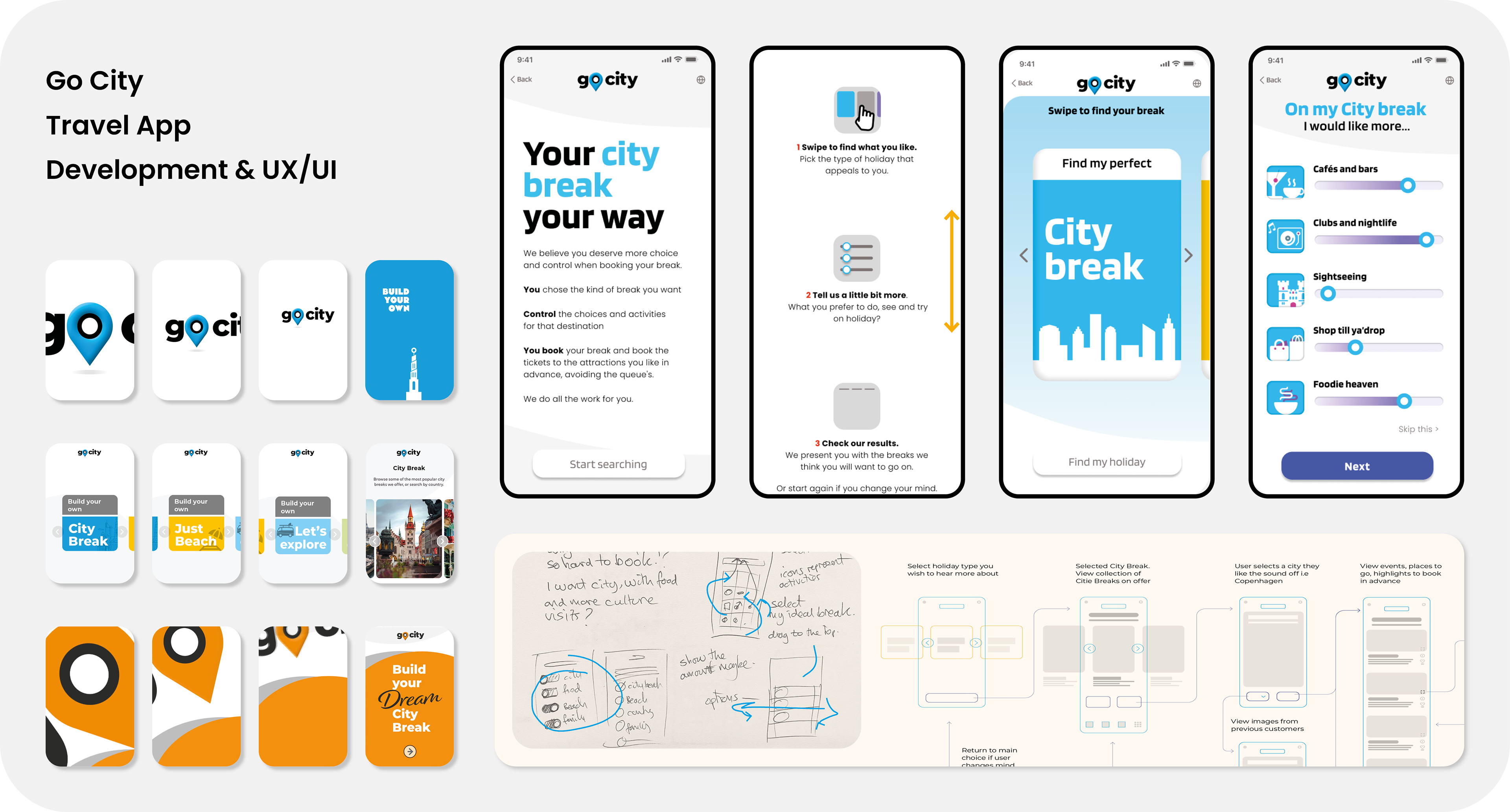
Iterative development
Testing new Brand, design, styling and colour system
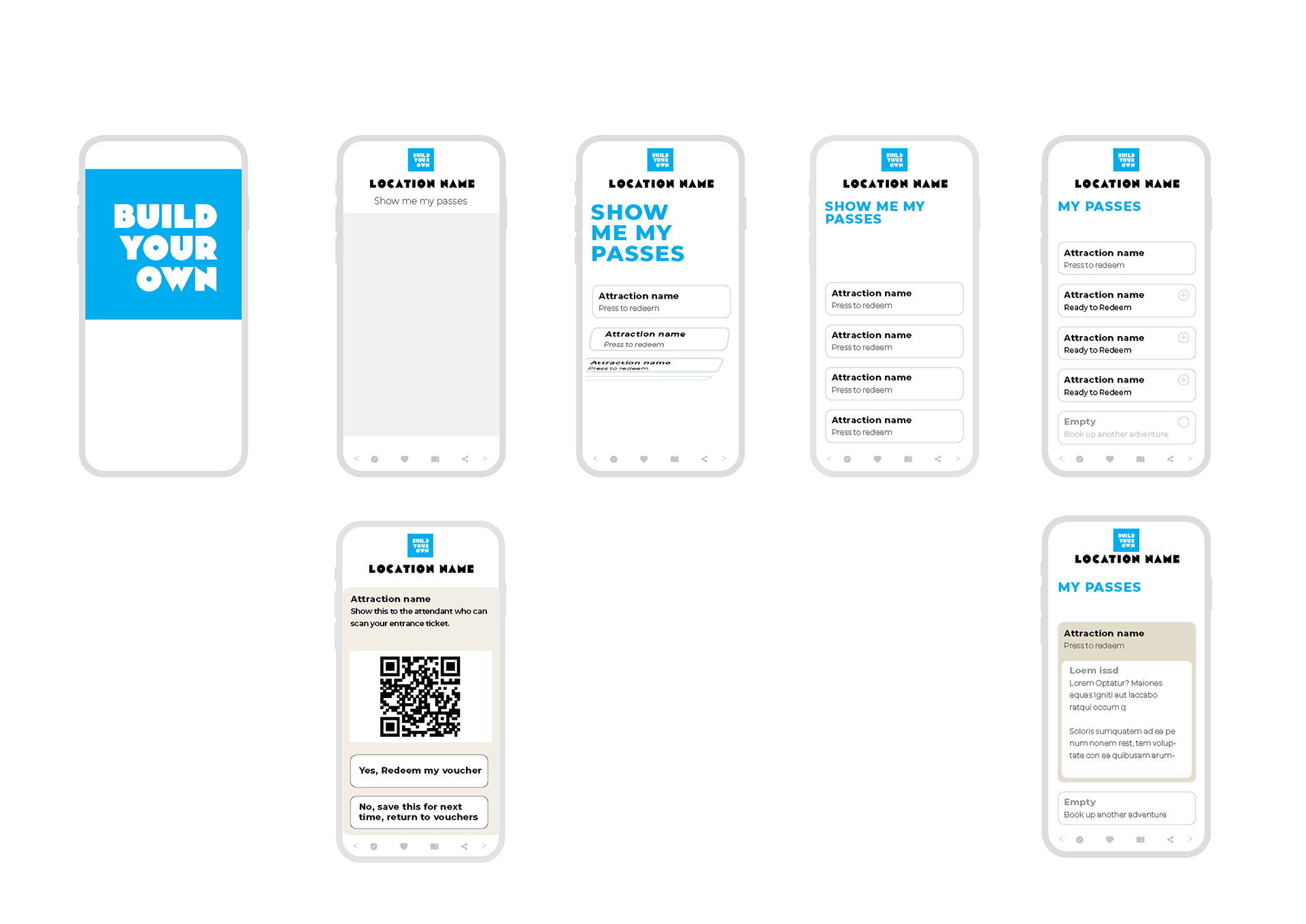
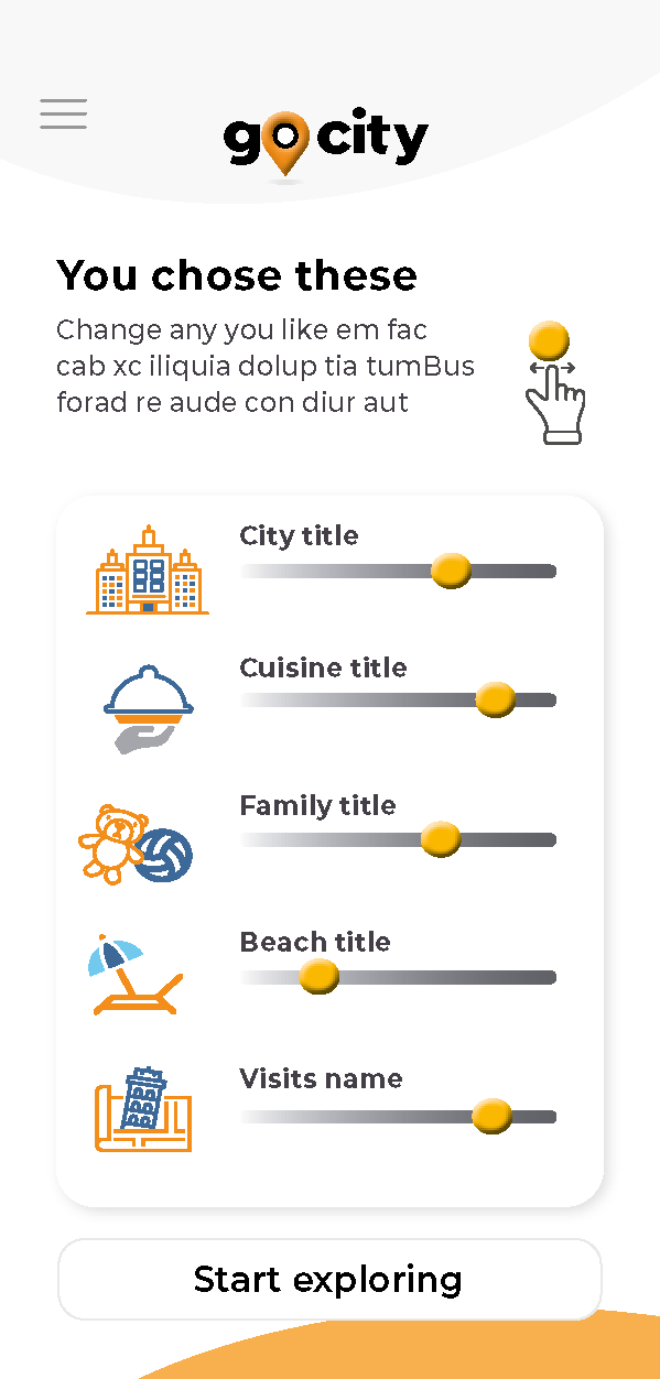
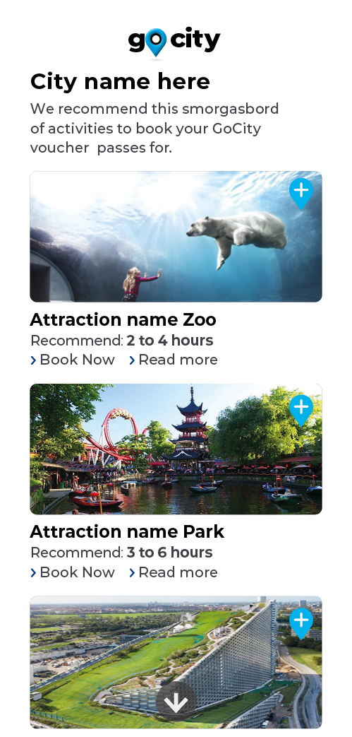
Ideas for showing your saved Pass wallet to events, locations booked in advance.
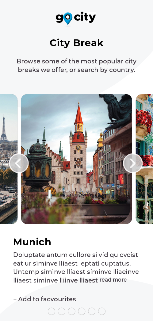
applied stock images for locations, sharing shots and many other other functions
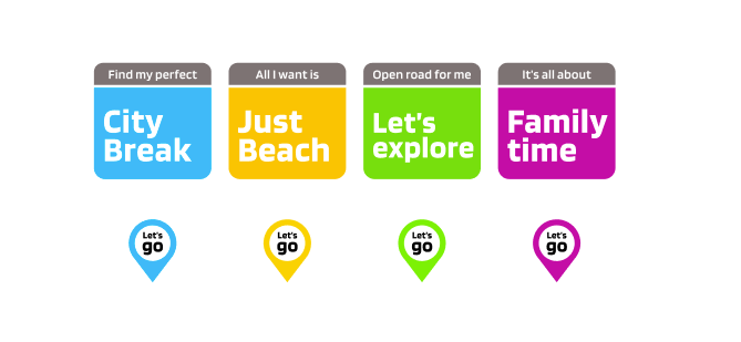
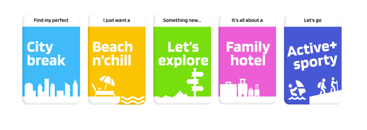
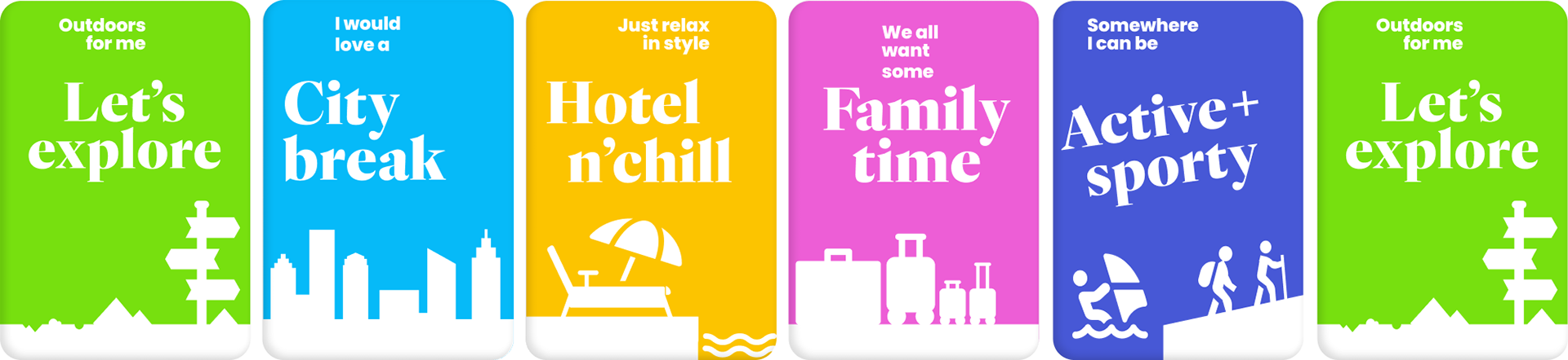
Icon development
Testing Icons for user recognition and choice, ranging from simple to big visuals
Testing new logo
Swipe for holiday type
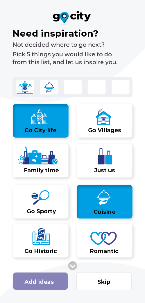
Tap icons you want to experience
Selections to view
Details of activities
Logo & Brand development
Researching travel, the instant recognition of travel icons, and getting feedback from users and their frustrations, I wanted to keep the icons and brand clean with travel visual links.
Tested a few ideas, based on location-finding icons and travel decision-making, eventually creating a bespoke clipped font that felt like road maps and route finders.

Refined screen designs for clarity and instruction
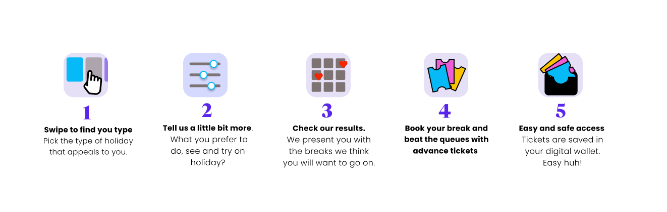
Intuitively crafting clear simple guide pages first, with a simple scroll instruction guide, allows user-centred interaction and involvement, allowing for a Buzz that the user is selecting the break they want.
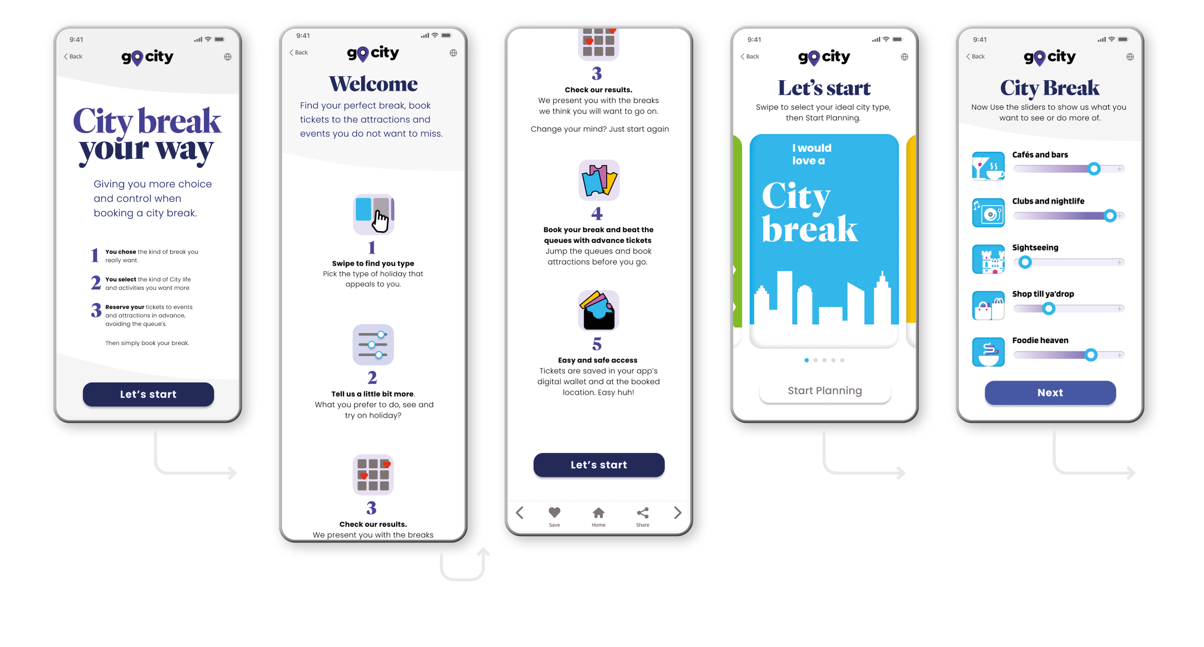
Engaging users, with a pivotal interactive choice
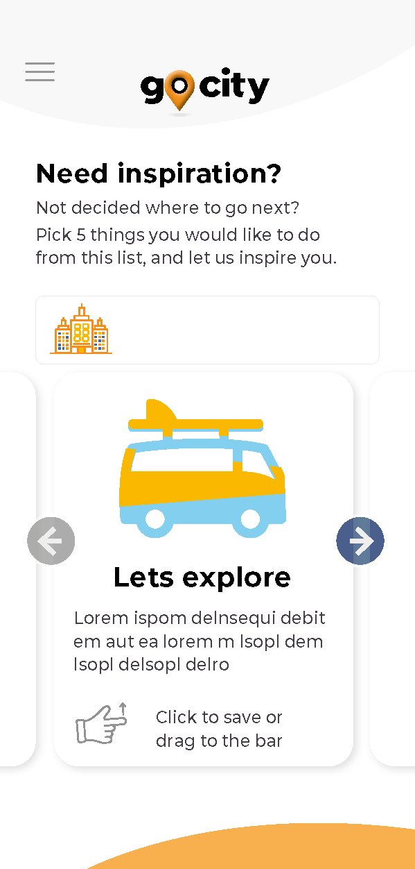
To enable the user to select the type of holiday, and then the areas of interest to them, allowing analytics to then provide the best suitable places and events, with the option to buy tickets in advance.
When tested, several users reacted very positively, giving feedback that they wished they were actually booking their holiday now, not testing a demo.
Demo animation