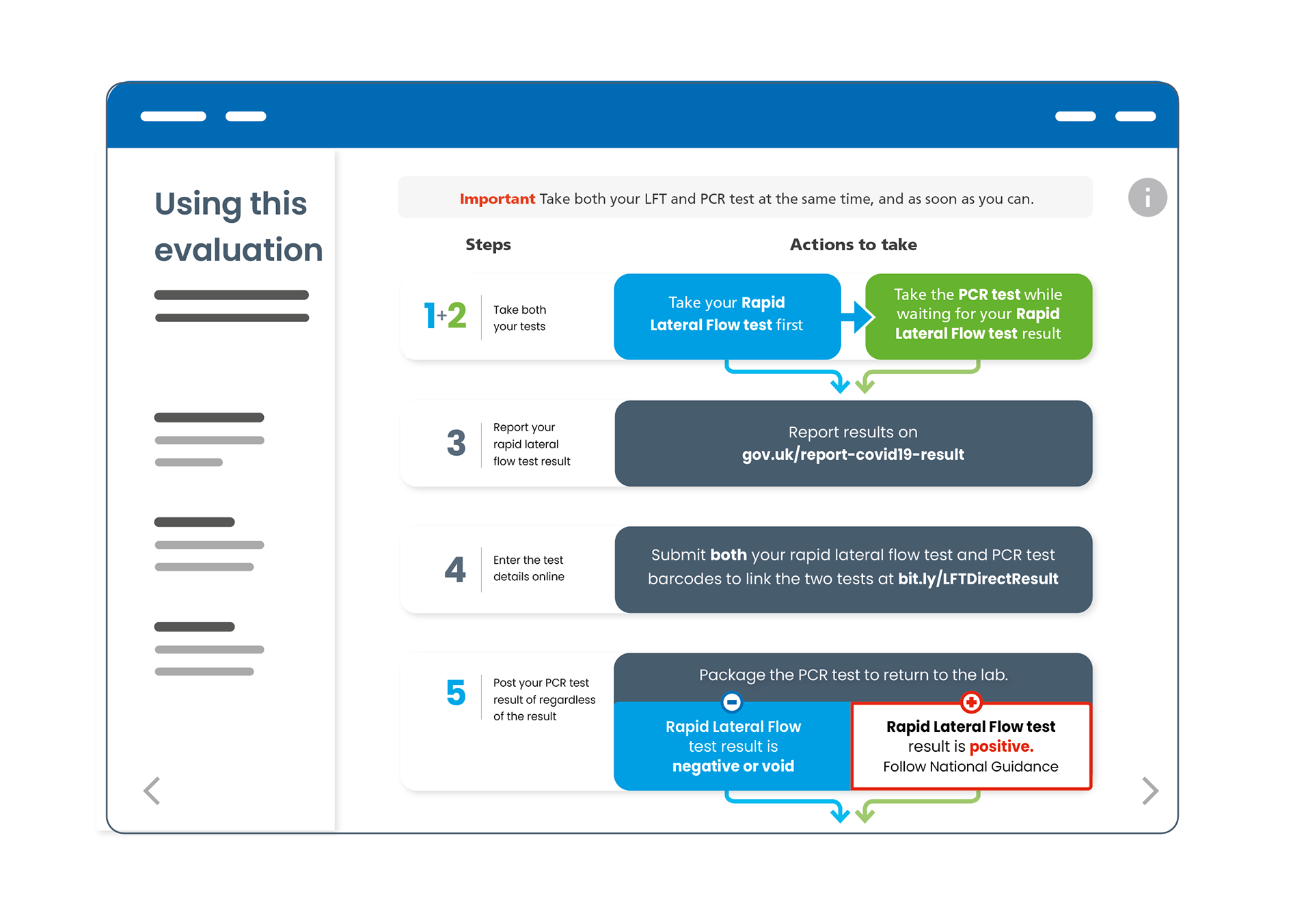
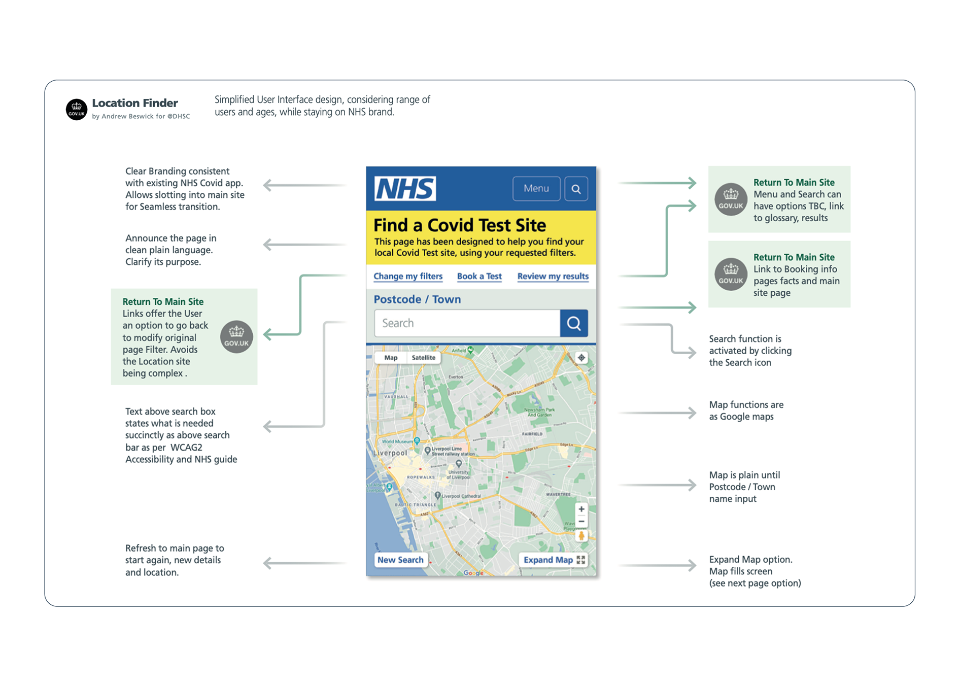
"In an Agile environment 0-1, testing to national deployment, Andrew developed a solid, evidence based GDS design, for cognitively diverse users'
Situation
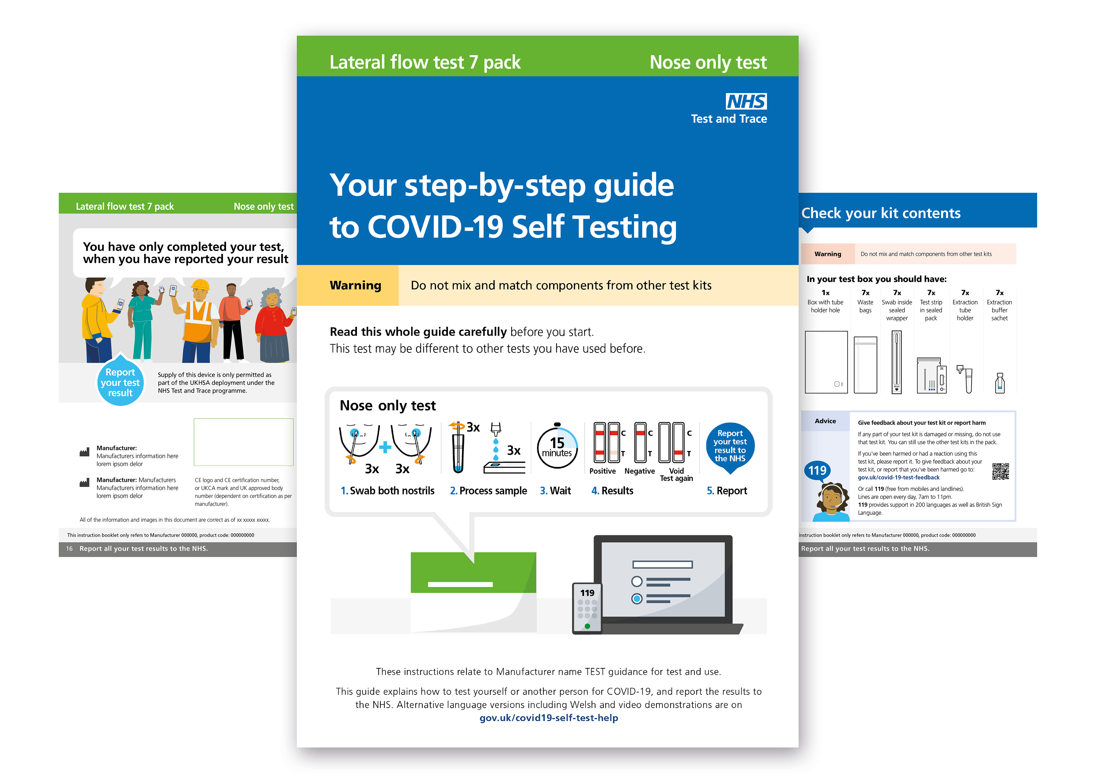
NHS required accessible drive-in test site guidance in Easy Read format for cognitively diverse users during the pandemic. This model was subsequently adopted for general test kits and informational guides throughout the UK.
Task
I realised I had to Develop scalable, user-centred Easy Read products that maintained NHS trust and brand consistency.
Action
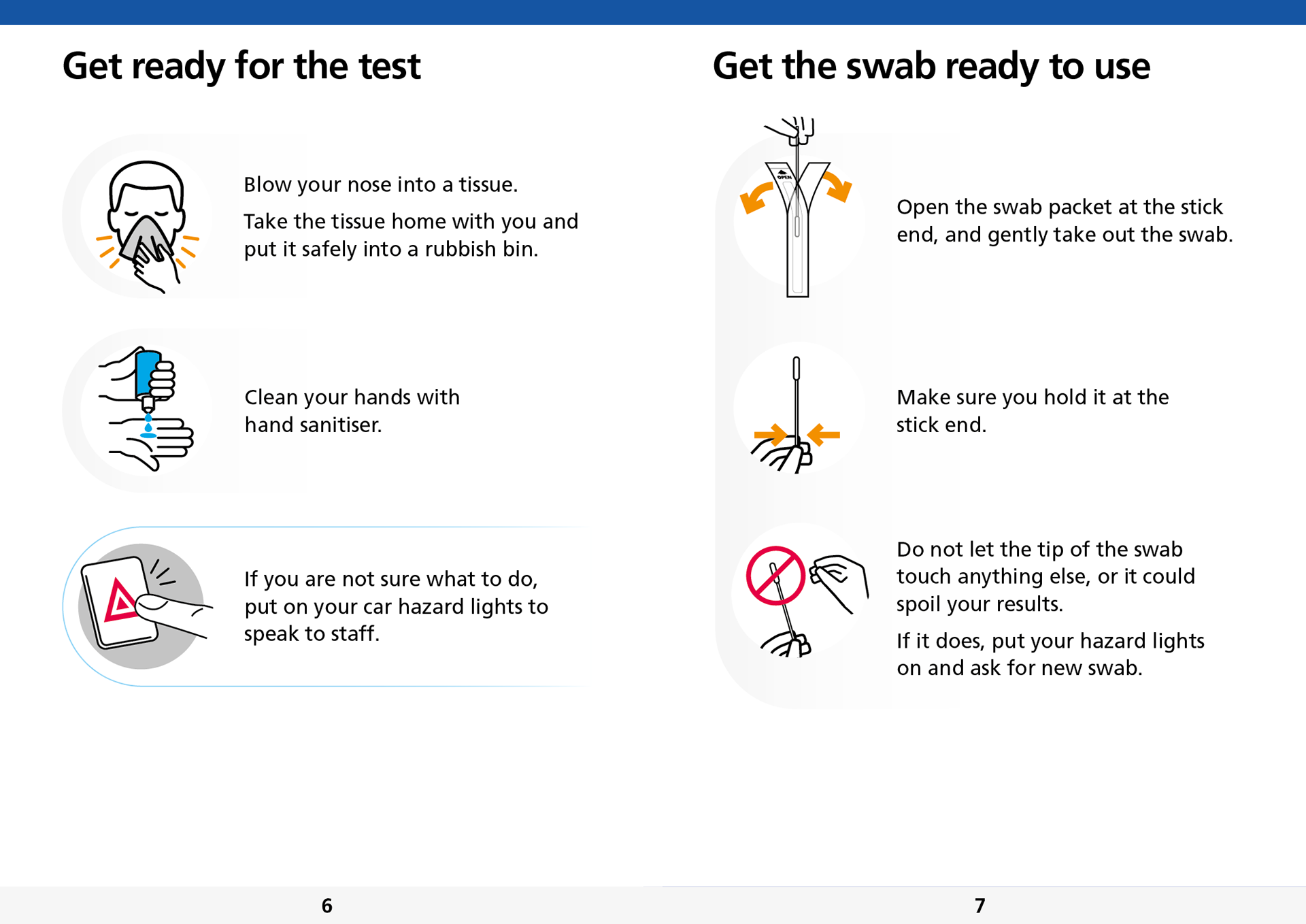
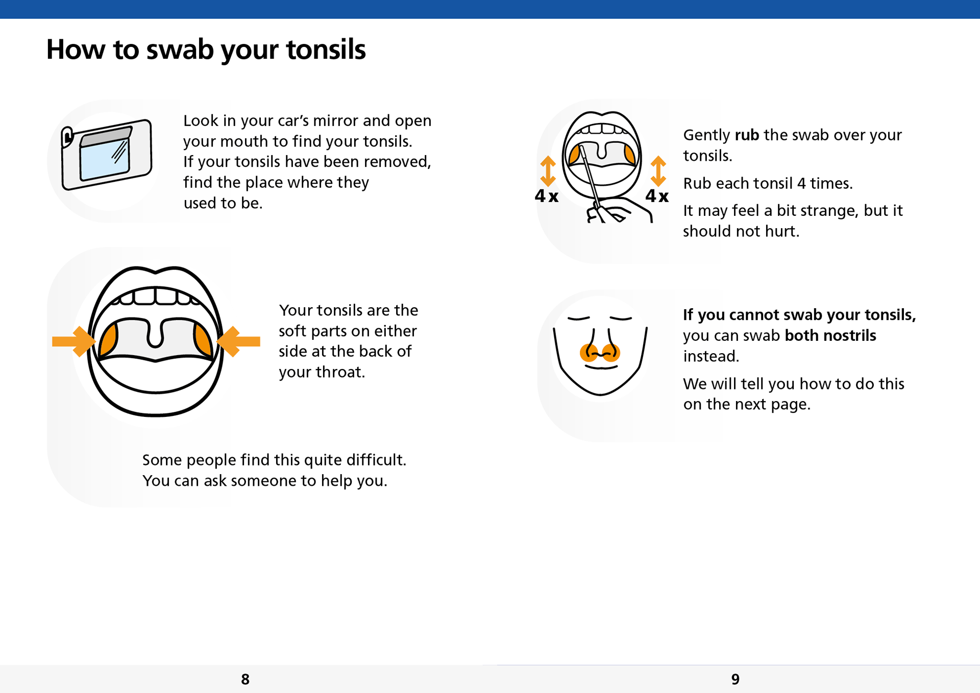
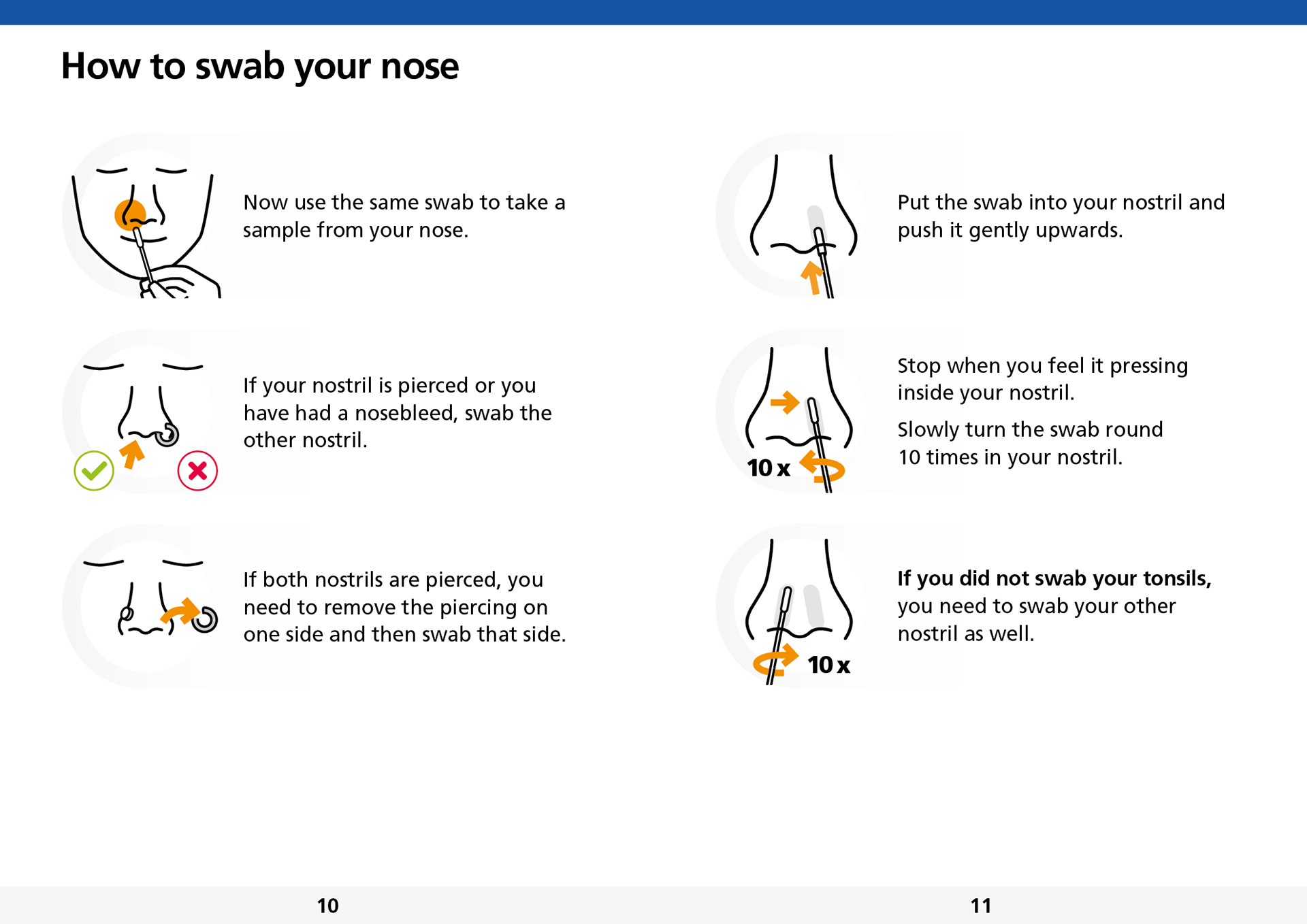
Created comprehensive Easy Read guidance series, leveraging NHS and UKHSA brand trust through existing imagery while developing new, intuitive icons specifically for Easy Read accessibility. Applied user-centred design principles to transform complex testing procedures into clear, digestible steps.
Result
My disruptive design approach of simplicity in language and visual design achieved positive user feedback and high uptake rates, with user testing revealing participants were "incredibly happy they could understand the process easily and at their own pace." This scalable design system was recognised with a Gold Standard Award for User Centred Design, successfully making critical healthcare processes accessible to cognitively diverse users through innovative iconography and simplified communication design.
This work transformed how we think about accessible healthcare communication. By putting cognitively diverse users at the centre of the design process, we created something that didn't just meet accessibility standards—it genuinely empowered people to navigate critical health services with confidence and dignity.
Users testing revealed they were "incredibly happy they could understand the process easily and at their own pace."
Addressing Cognitive Challenges in Easy Read Design
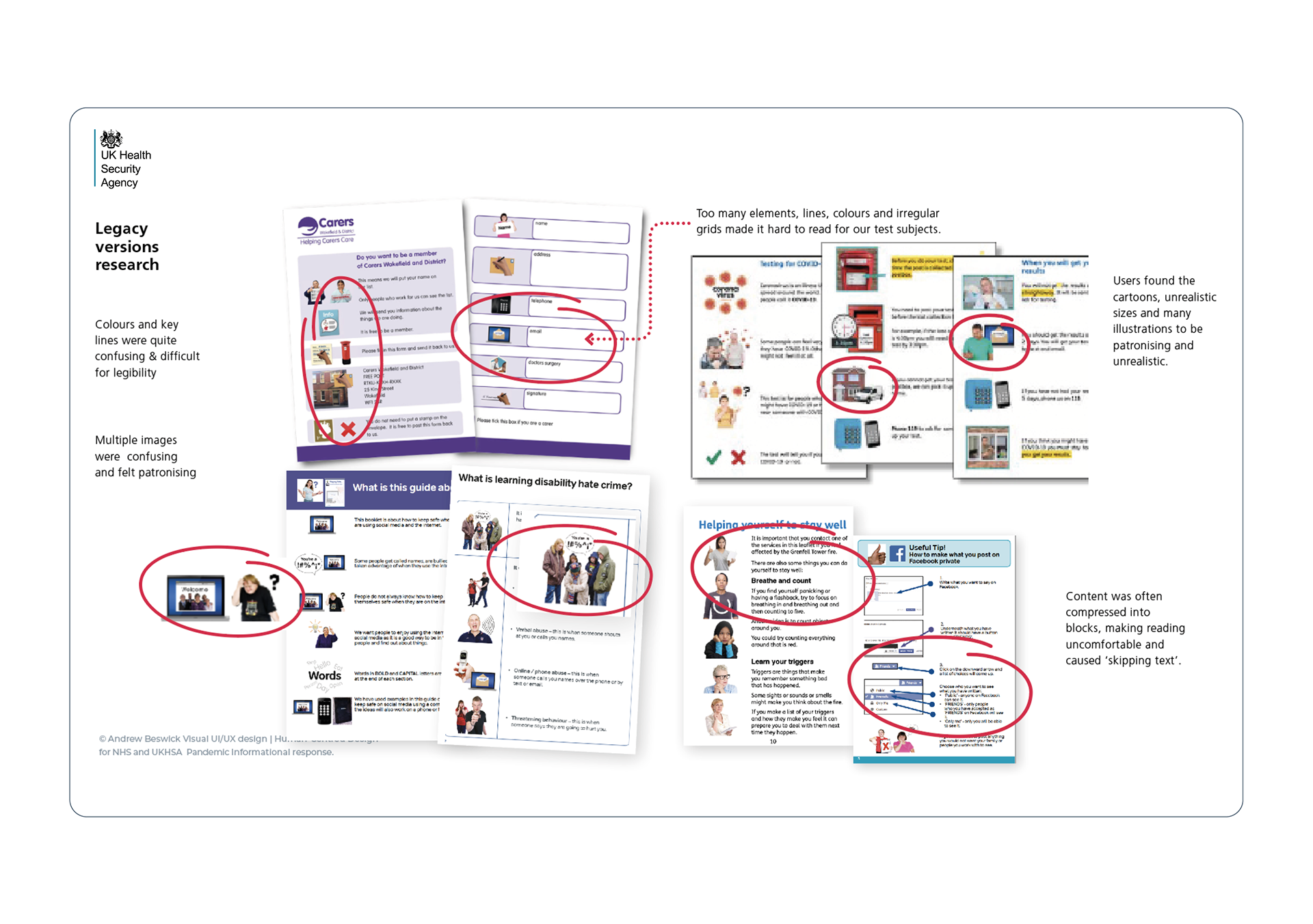
Users with cognitive challenges, reading difficulties, sight impairments, and disabilities required separate Easy Read versions of healthcare products. While research notes showed similarities to existing IFU test materials, deeper analysis revealed the entire Easy Read setup felt like an afterthought rather than an integrated accessibility solution. I redesigned the approach to ensure Easy Read materials were purposefully designed from the ground up, not retrofitted, creating truly inclusive healthcare communications.
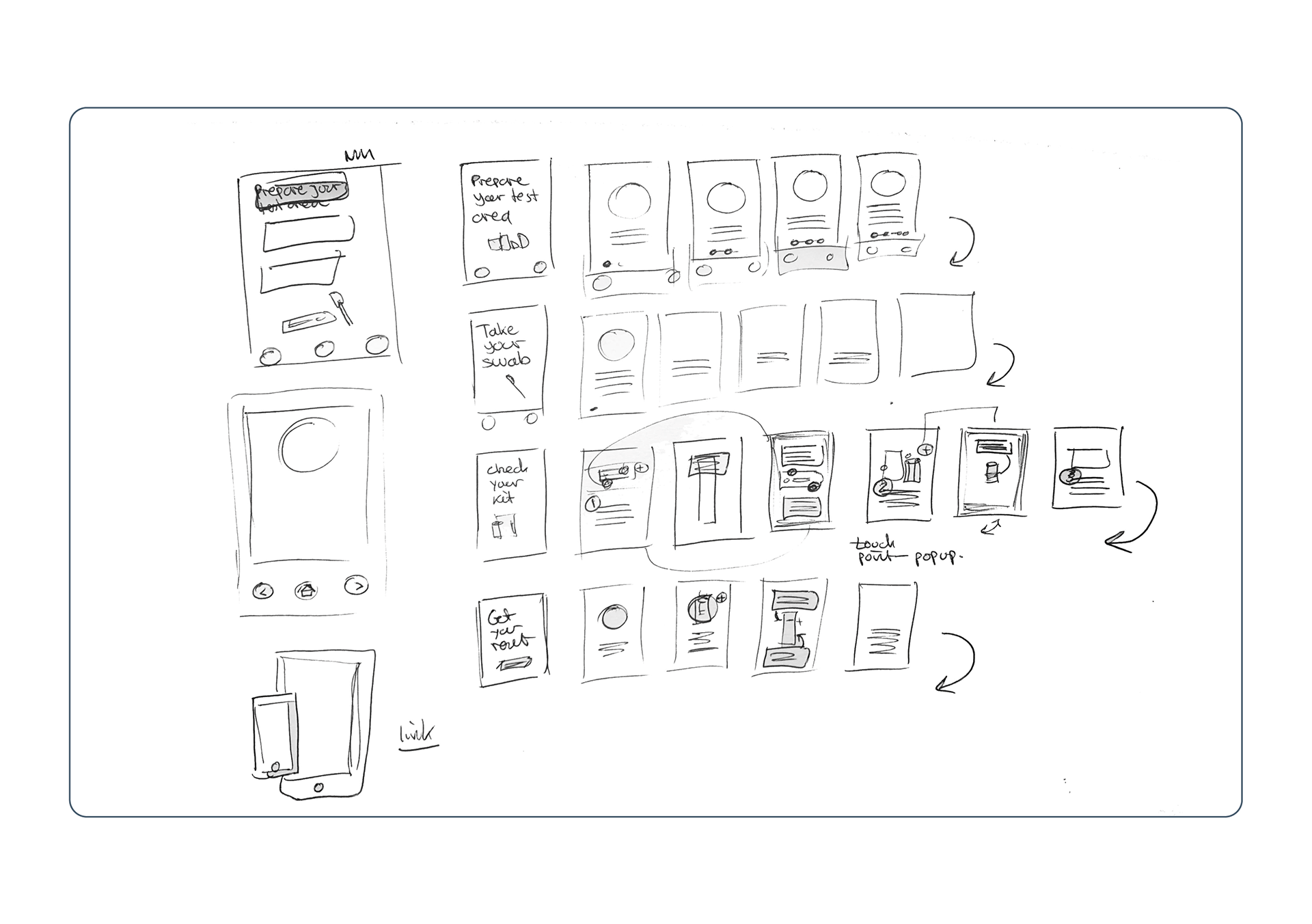
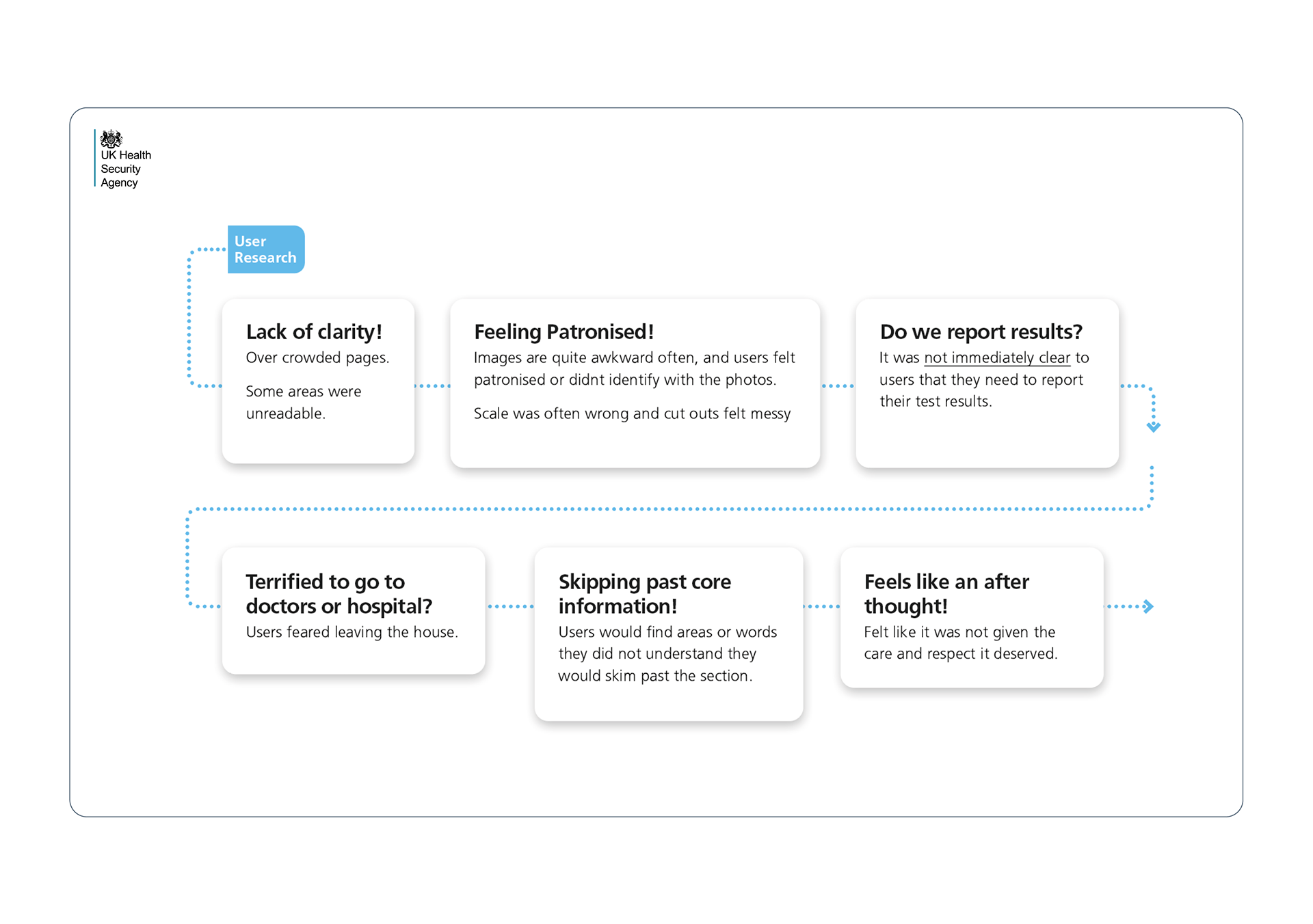
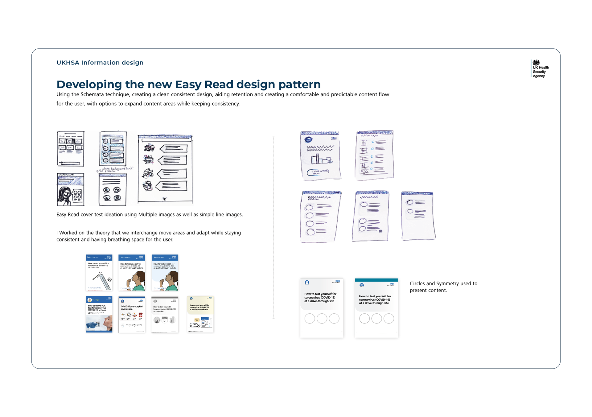
Ideation Sketches, Analysis of Existing Blocks, and Disengagement and Pain Points
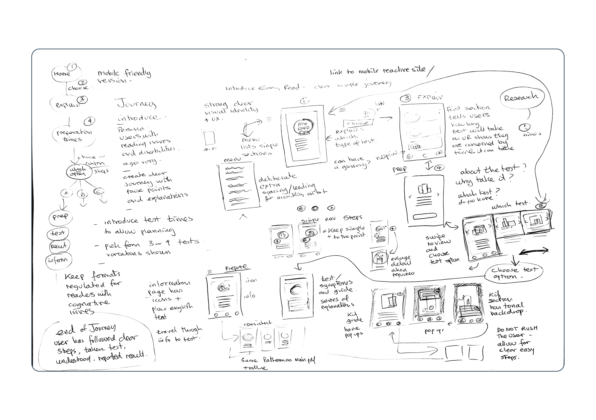
Developing User Centred Designs
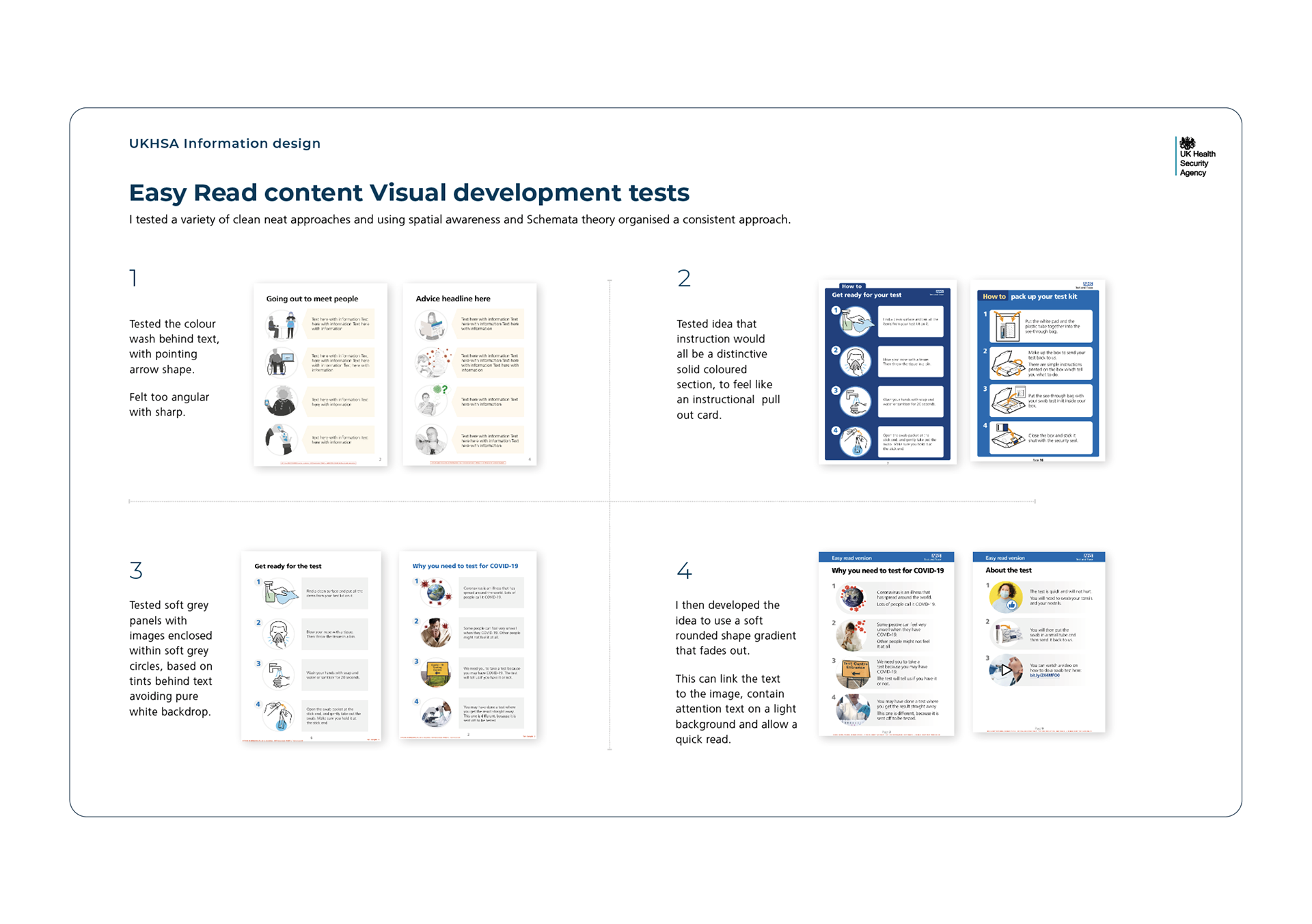
Through qualitative research and iterative feedback, I developed GDS-compliant design systems that excelled in live user testing. My process included comprehensive Easy Read analysis across service and product designs.
Research revealed users felt patronised by existing approaches. I challenged this, creating methodology that respected users' intelligence while maintaining accessibility standards—delivering dignified design that users genuinely valued.
Creating dignified Easy Read materials that users genuinely valued, moving beyond tokenistic accessibility to truly inclusive design.
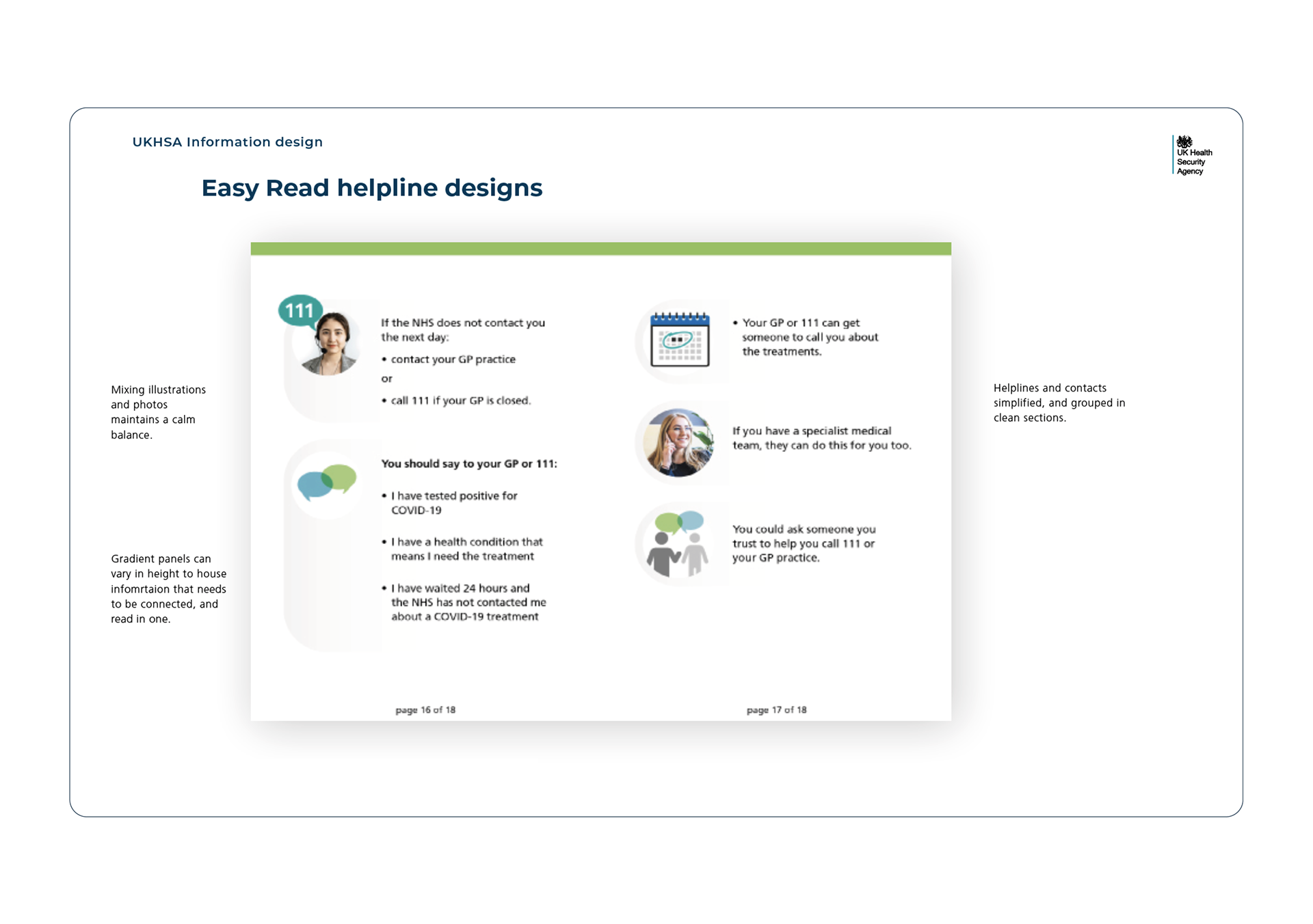
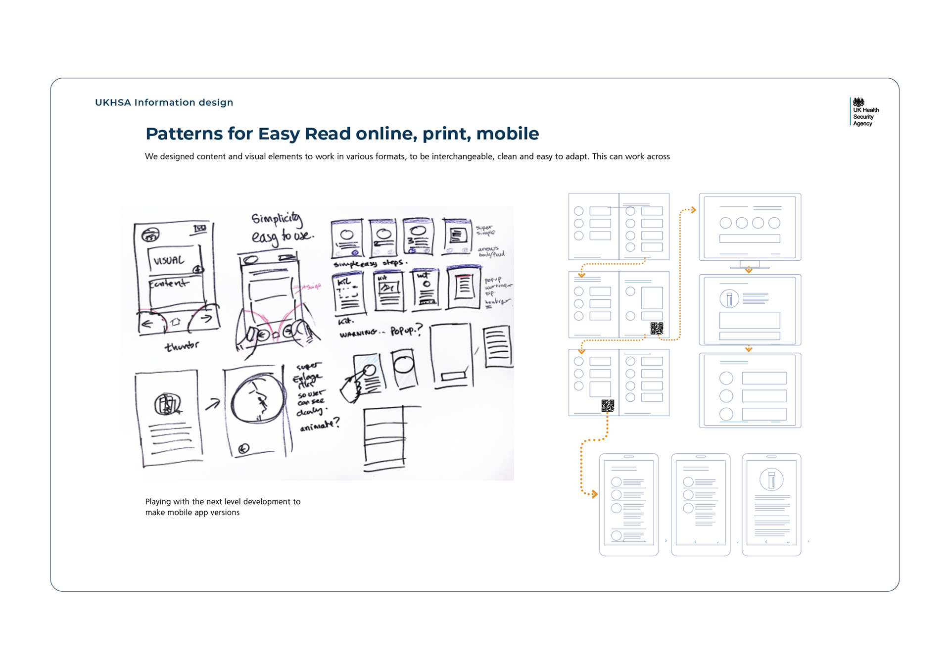
Final Live Design Launch
Through agile iterative design processes, I conducted comprehensive Easy Read analysis including design testing, printing considerations, and visual style evaluation across service and product designs.
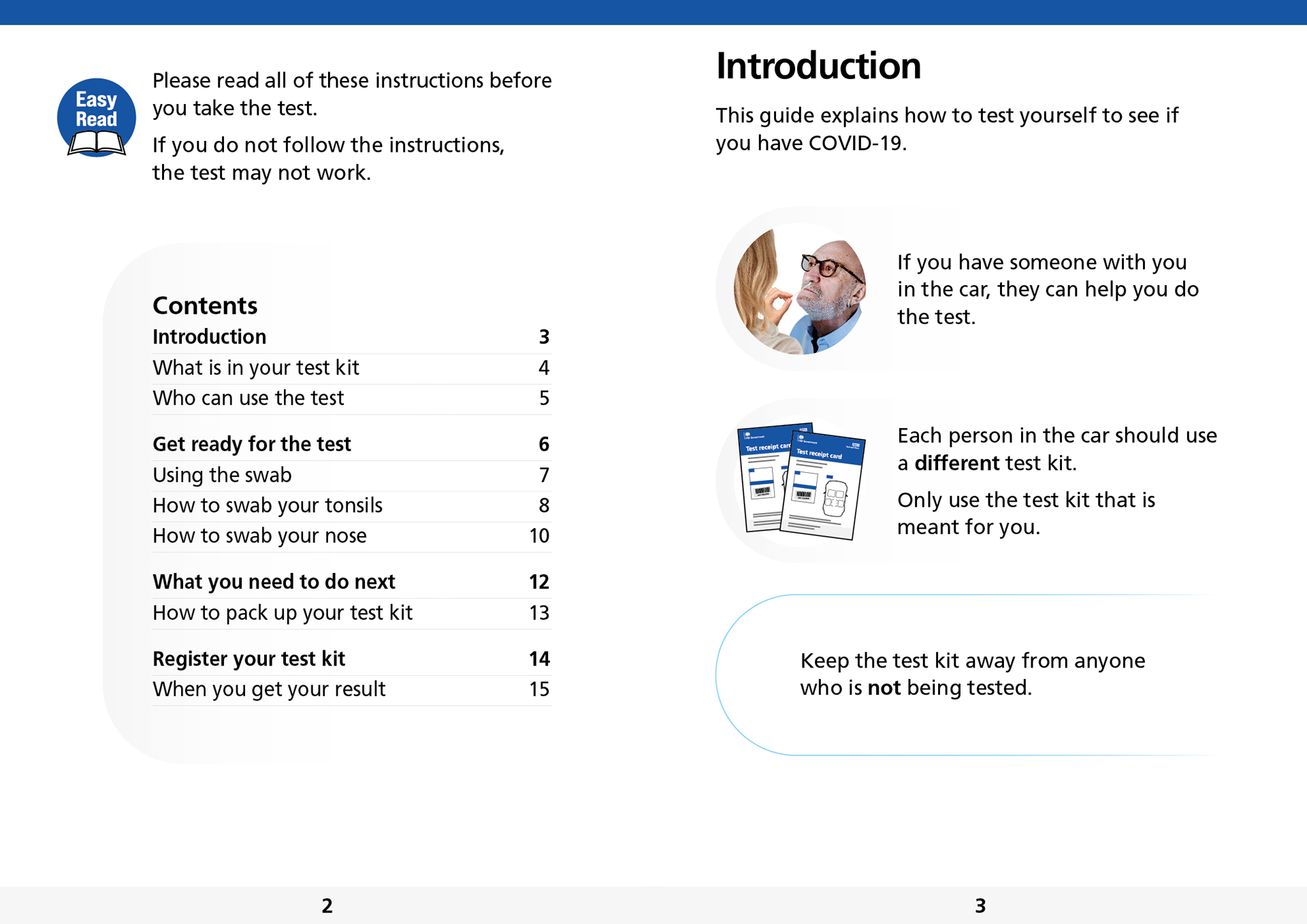
Related Easy Read Test Site Guidance
Brand and Marketing required urgent signage for UK test sites to guide worried, rushing, or confused members of the public. I redesigned a series of icons for maximum simplicity and clarity, utilising NHS trusted brand colours and creating an editable application system that allowed for on-site translation and rewording when needed. This rapid-response solution delivered critical way-finding during the pandemic emergency.
Using simple geometric shapes, I recreated a collection of icons that received bad User Research feedback, and made them simple clear linear icons, with Easy Read and UCD methodology.
